MICROSOFT
Bing Maps + Images
Microsoft PixelSense App
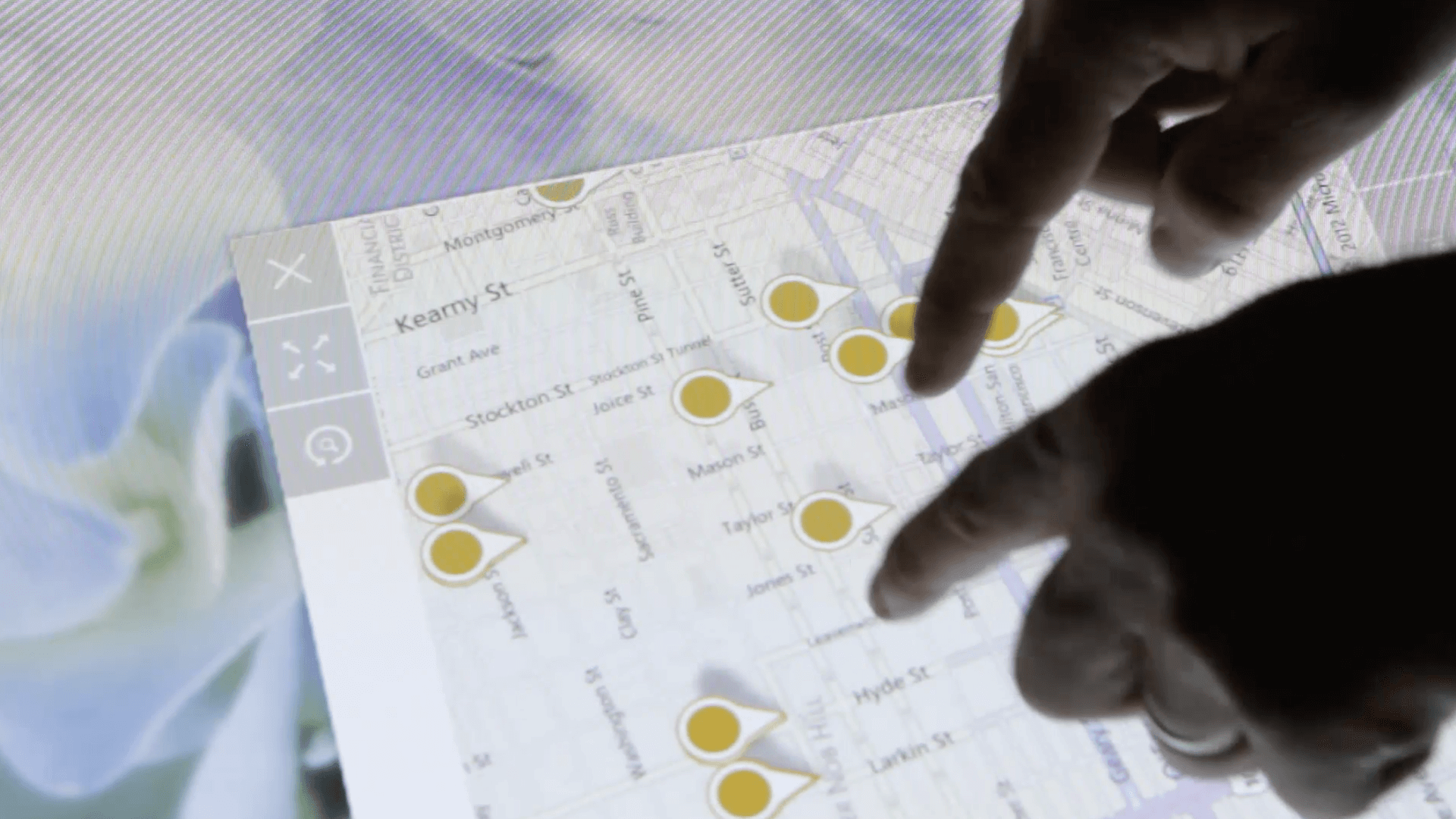
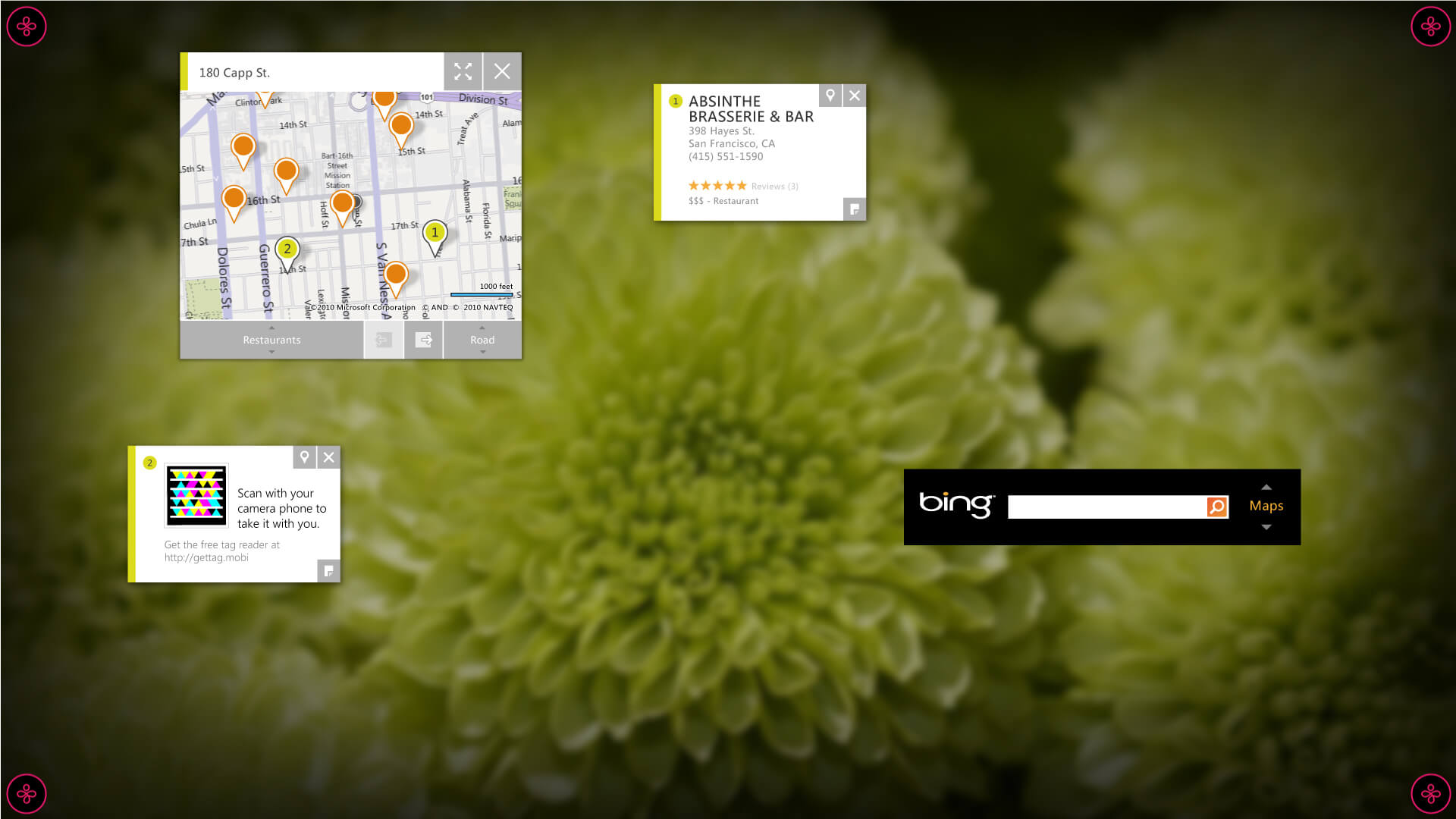
We collaborated with the Microsoft Bing team to design and develop a touch-first, multi-user version of Bing Maps for the Microsoft PixelSense table. This was the first application that came pre-installed on the PixelSense touch-table platform.
The Bing Maps application that we created was unique in its focus on direct manipulation of content, rather than using a plethora of buttons and heavy chrome that can impede interaction. Our design was intended to provide an intuitive and seamless user experience.
My Role
As the Visual Design Lead, I was in charge of the overall aesthetic and user interface of the project. I worked closely with the Interaction Designer and development team throughout the entire process, from initial concept creation to final delivery.
Microsoft Bing
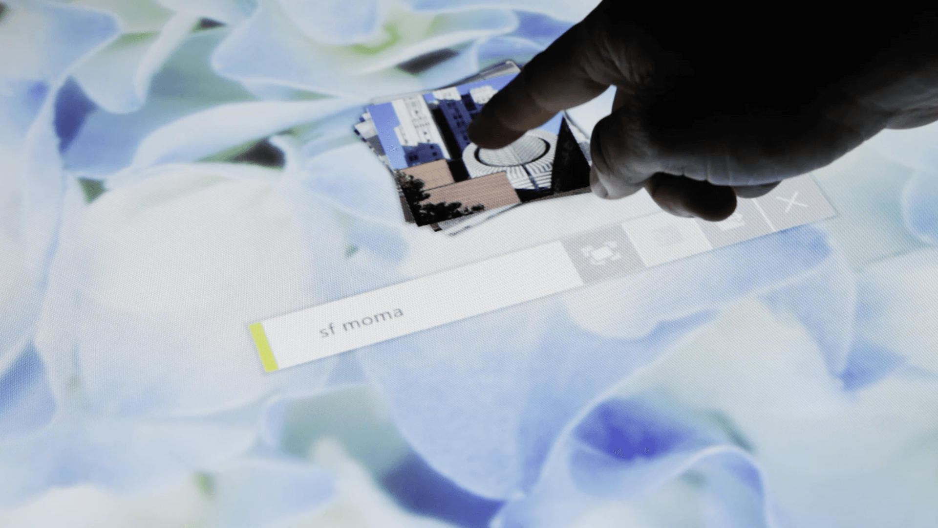
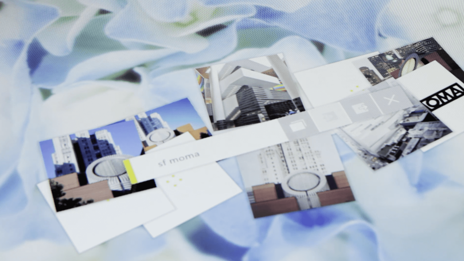
Image Search
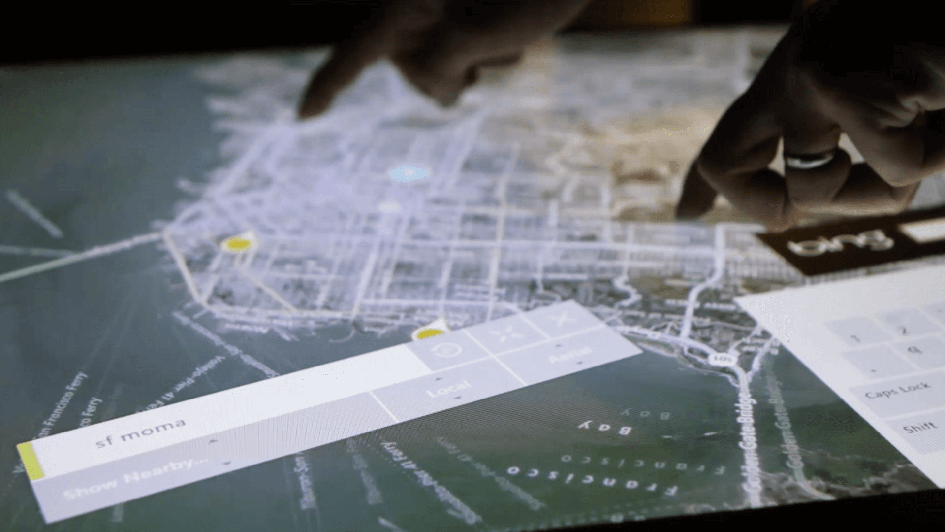
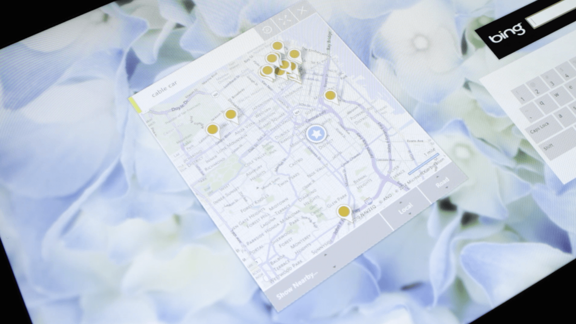
As a user interface designer, I developed a modular design that provided users with the flexibility to easily switch between image search and maps search within a single, intuitive container. The design aimed to improve the user experience by making it simple and convenient for users to access both types of searches without having to navigate through multiple screens or menus. The user interface was designed with a focus on usability, making it easy for users to find what they need and complete their tasks efficiently.
We designed a multi-user interface that took into account the needs and interactions of multiple users simultaneously. It was particularly useful in collaborative environments such as shared workspaces, classrooms, or public spaces.
Microsoft Bing
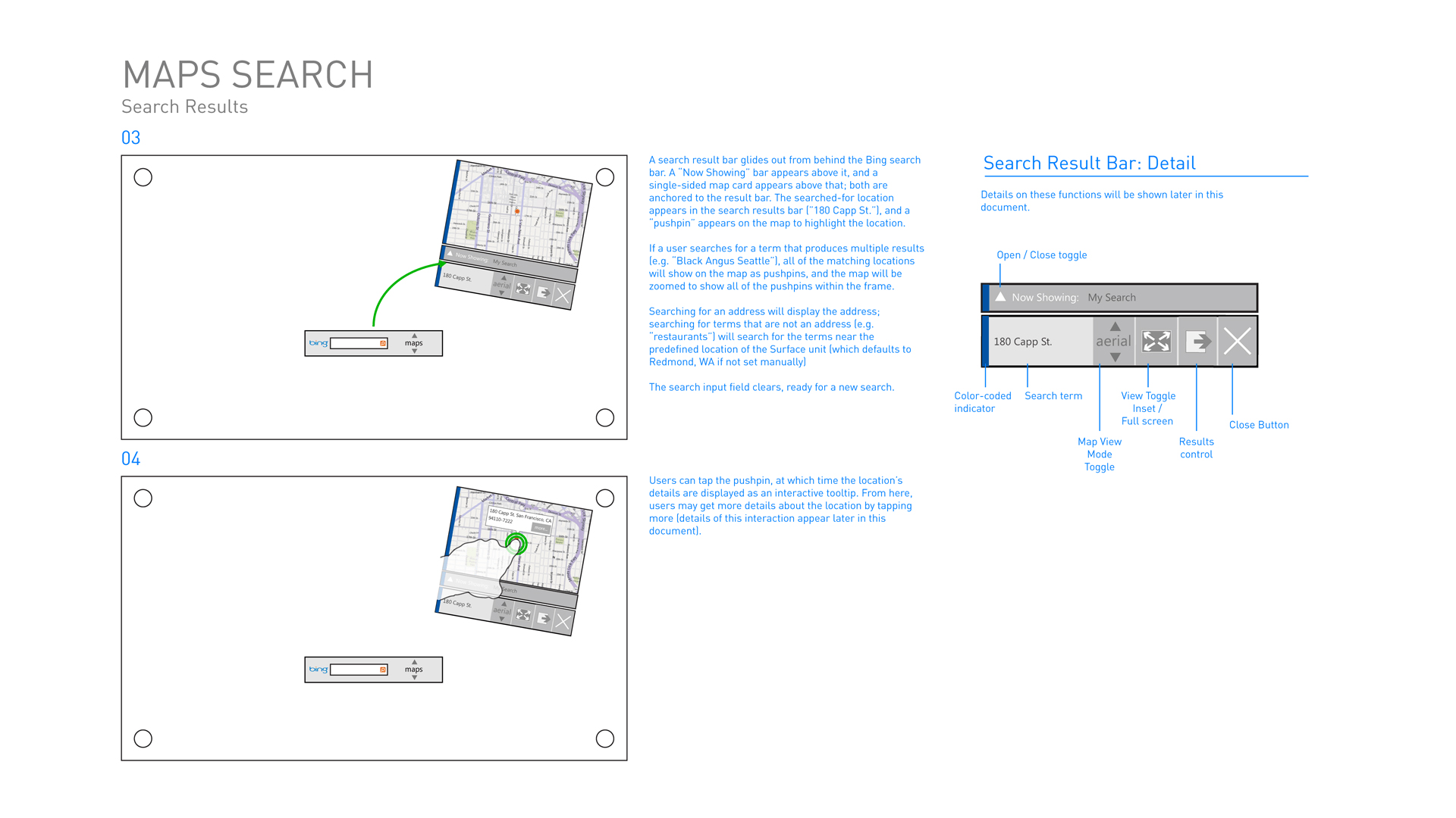
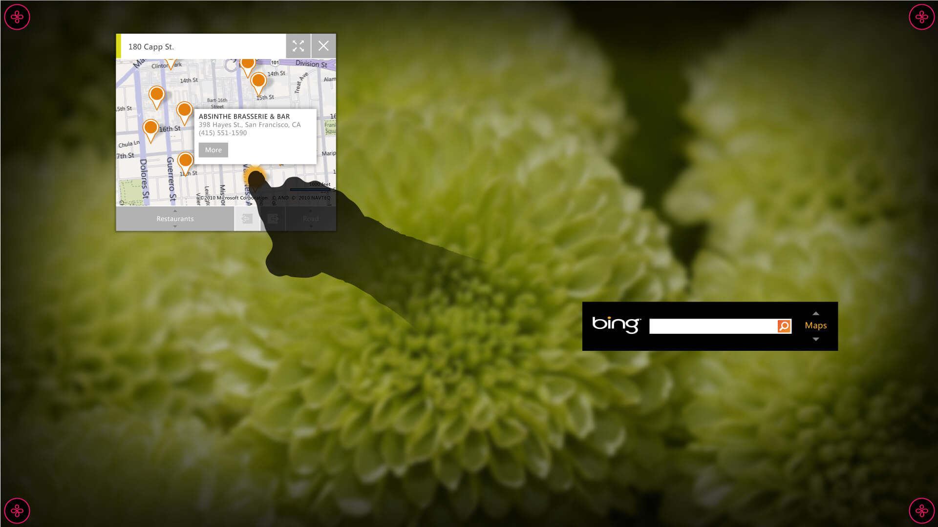
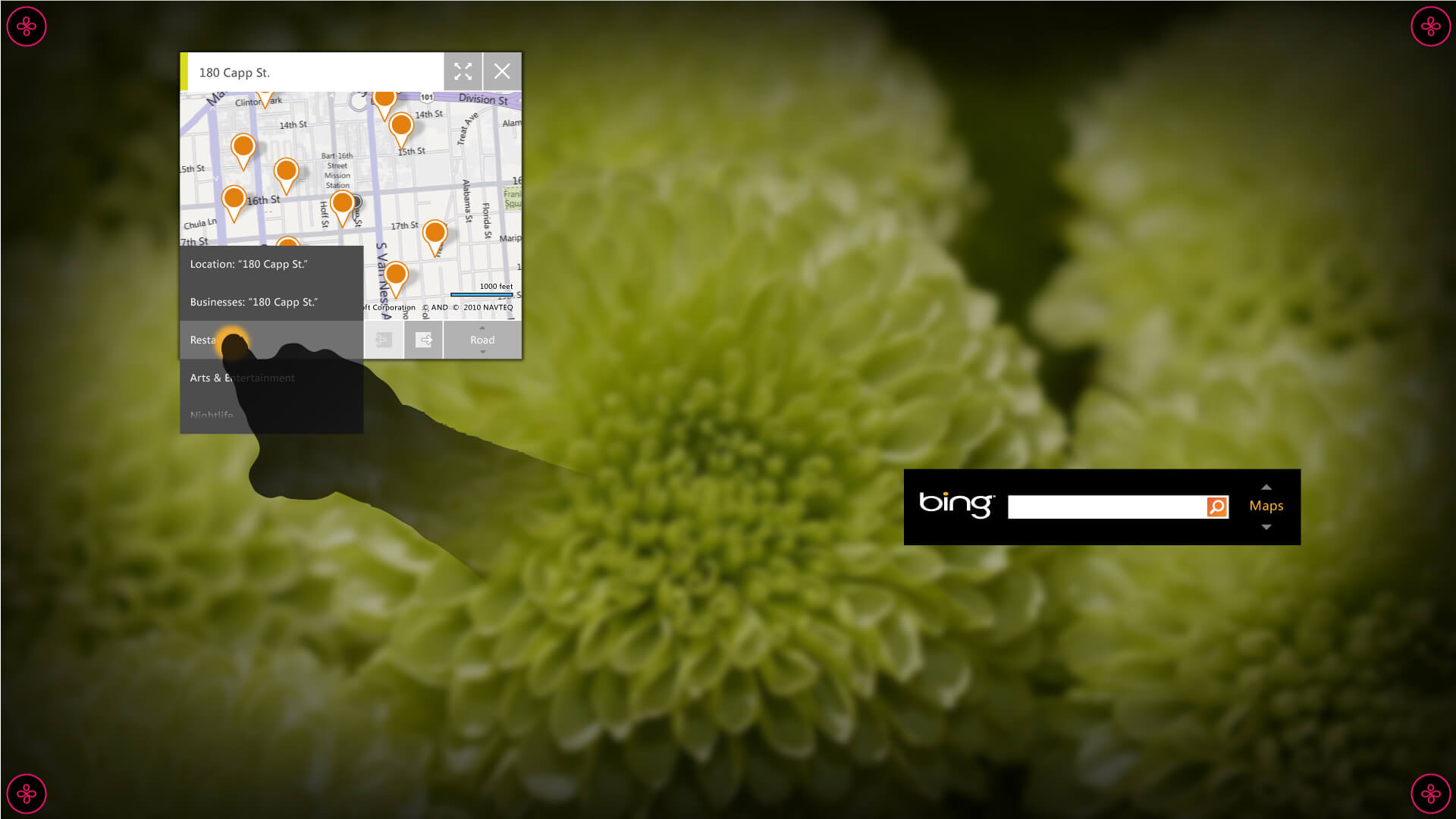
Maps Search
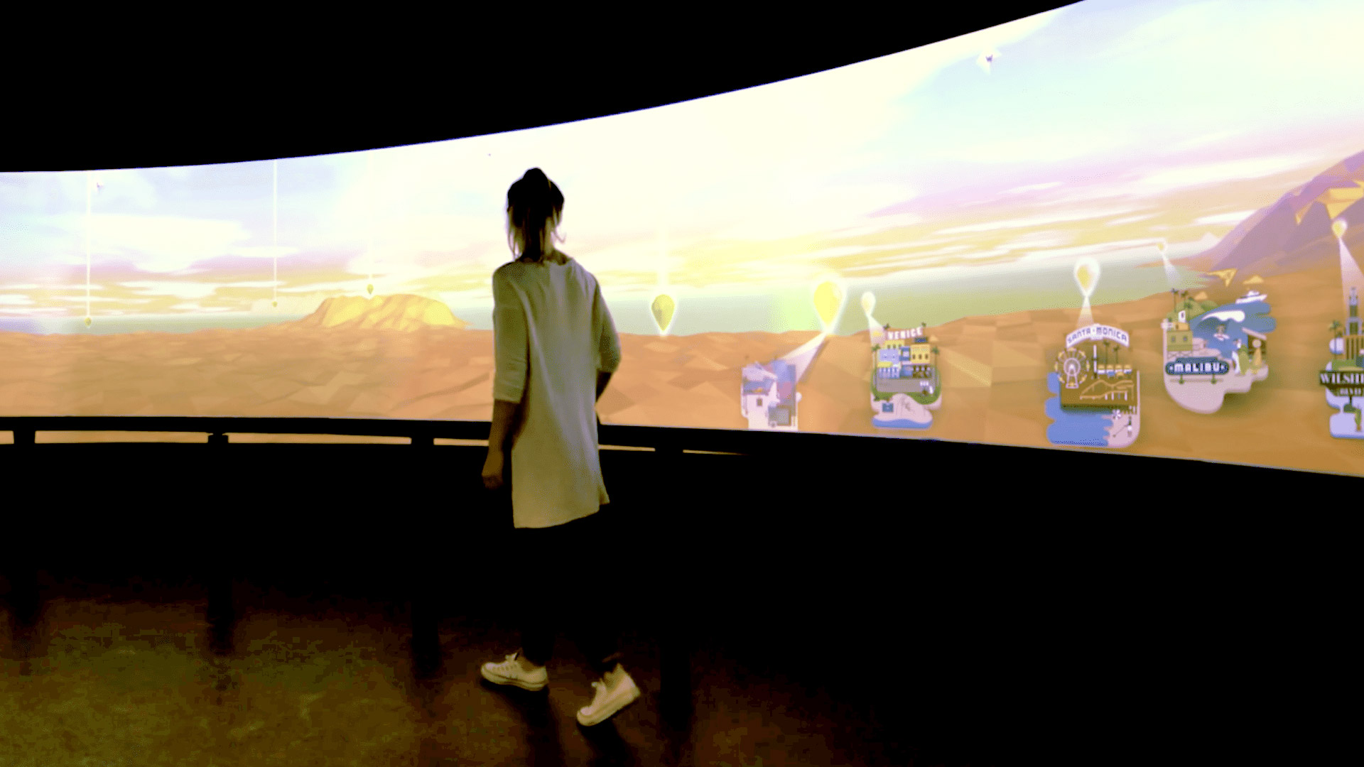
The 360° Teleporter takes advantage of Microsoft’s Photosynth technology to give visitors unprecedented access to sites throughout the Seattle area, some of which include swimming through Seattle Aquarium’s octopus tank, walking from the Seattle Sounder’s locker room onto the field alongside the starting eleven, and even getting rare access of one of Seattle’s famous Lake Union houseboats.
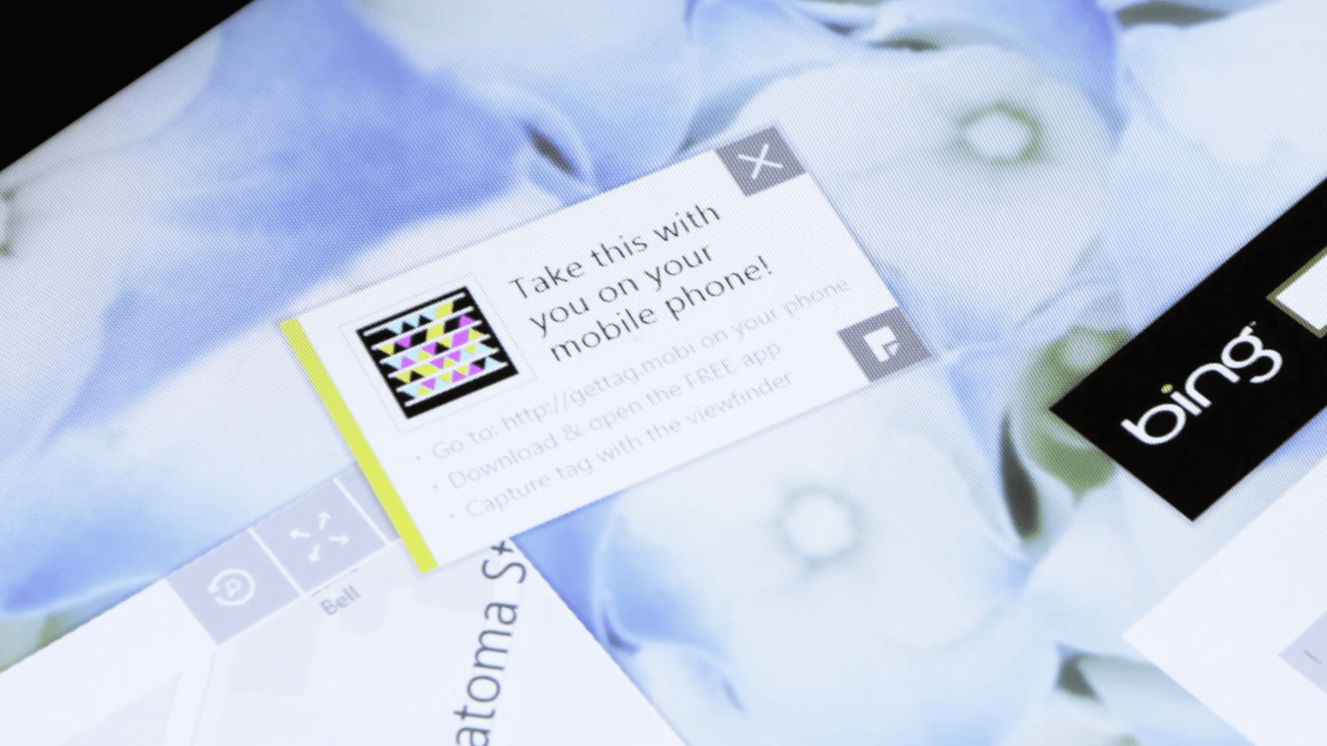
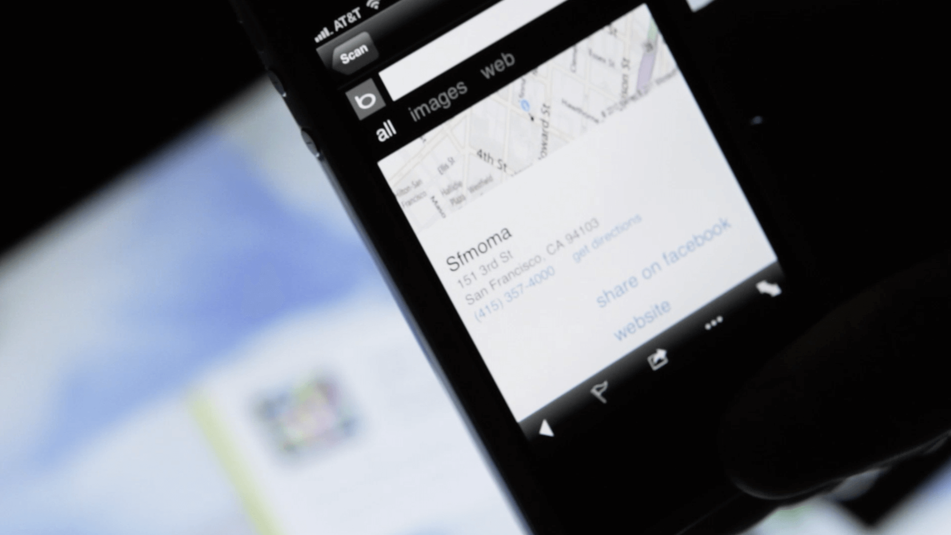
Scan and Go
Before visitors start exploring the landmarks, they can pan and zoom the large gigapixel image of Seattle. The carousel comes alive with animated videos for each location to give context to the user.
The compass at the top gives the visitor a sense of direction as the move around the image.
Wireframes to High-fidelity Mockups
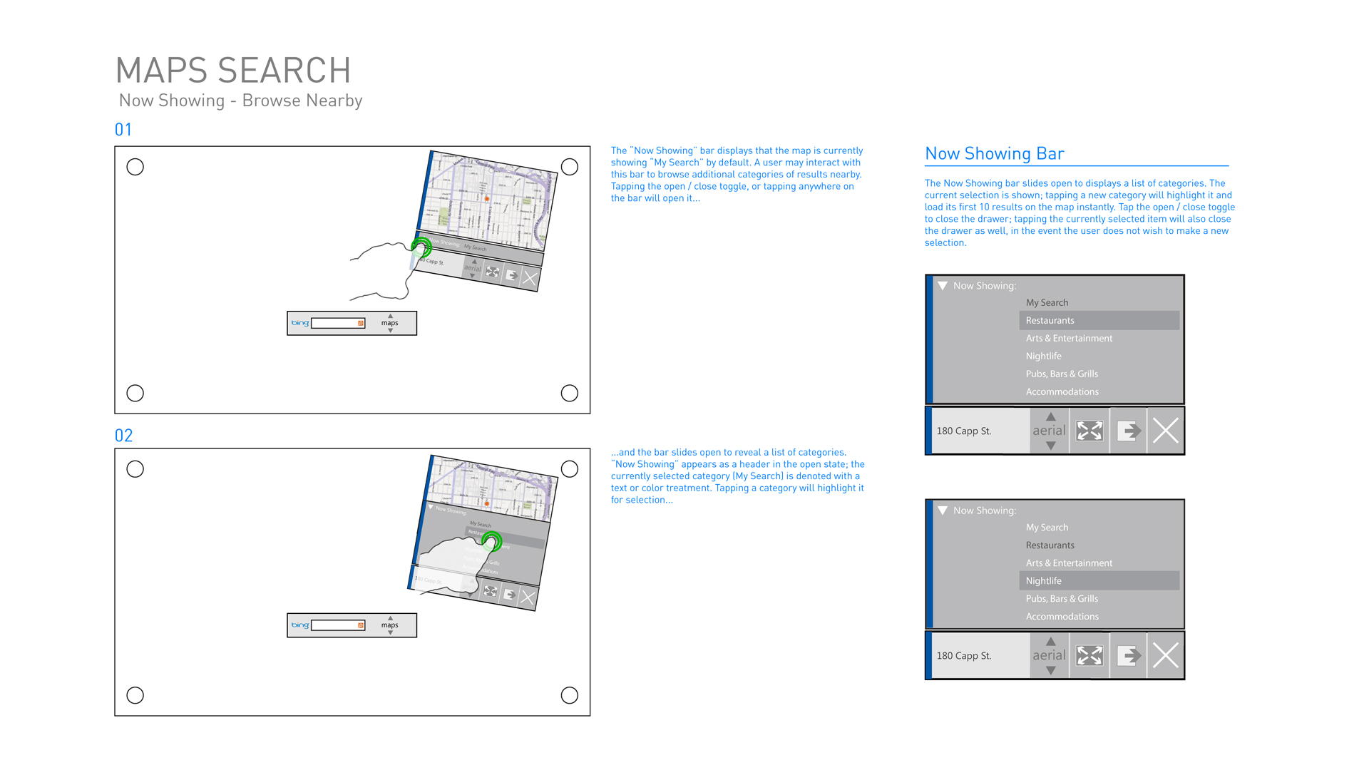
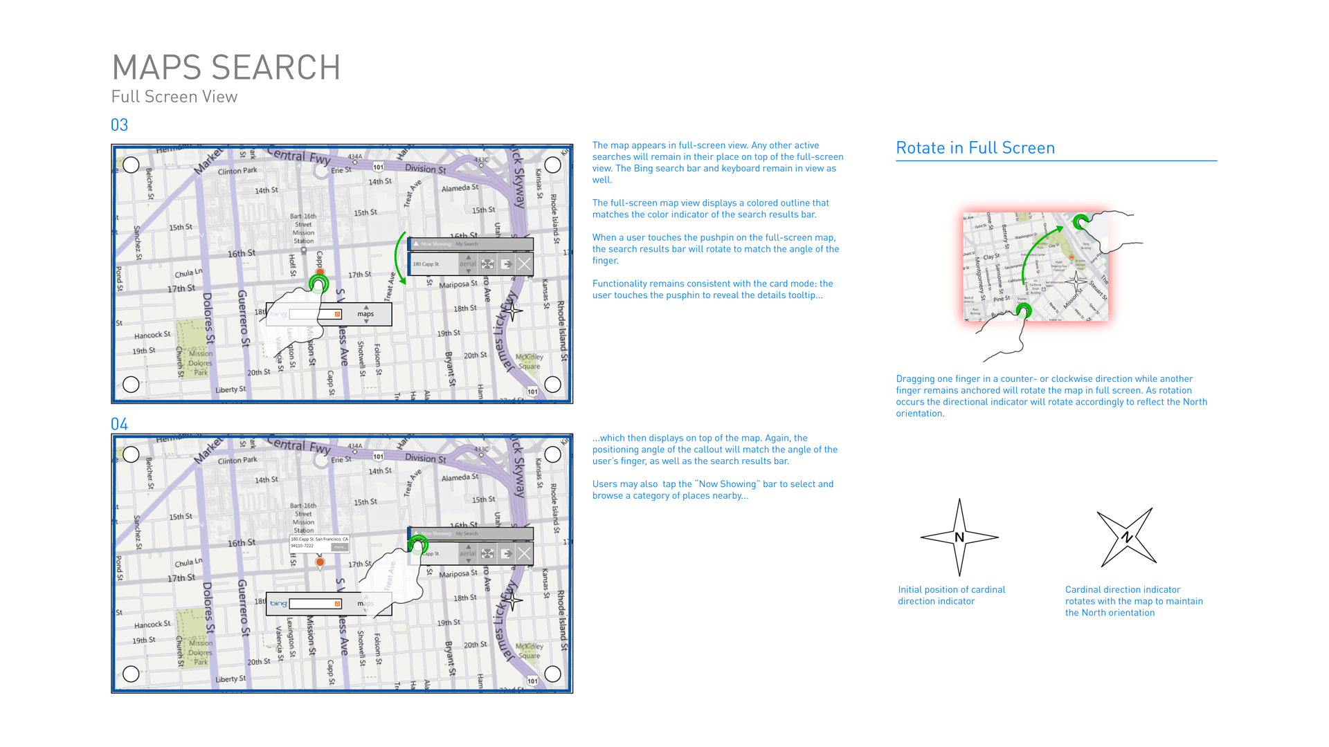
As a visual designer, I collaborated closely with the interaction designer to bring their detailed wireframes to life. I transformed the wireframes into high-fidelity visual design comps using Adobe Illustrator. I ensured that the final designs were not only visually pleasing but also followed the principles of good user interface design. The examples shared below showcase this transition from wireframes to high-fidelity visual designs. My goal was to create cohesive and polished user interface that were in line with the project's requirements and design guidelines.
Awards
2013
HOW Design International Design Awards
Award: Merit Award, App Design
