SECTION4
Member Center
Membership Platform
Quality business education can be time-consuming and expensive. Section4 is an online business education platform, founded by Scott Galloway, looking to make elite business education affordable for all.
They offer condensed, low-cost online courses, or “Sprints” taught by respected business school professors and industry experts.
Background
Section4 community managers built a proof-of-concept beta member portal using Notion. The Notion member portal was well received but lacked transparency, was difficult to maintain, and wasn’t integrated with Section4’s product ecosystem. Research told us that the students were seeking a deeper learning experience during and in between Sprints.
My Role
As the lead product designer, I was responsible for overseeing the design of the UI and UX for both the learning and membership platforms. This included conducting visual research, creating user flows, wireframes, prototypes, and high-fidelity mockups, and working closely with the Head of Product, Product Managers, and Engineers to plan and execute the future of the platform.
Problem Statement
How might we provide opportunities for our students to learn and connect throughout the entire year while increasing business revenue and retaining a high NPS?
Design Process
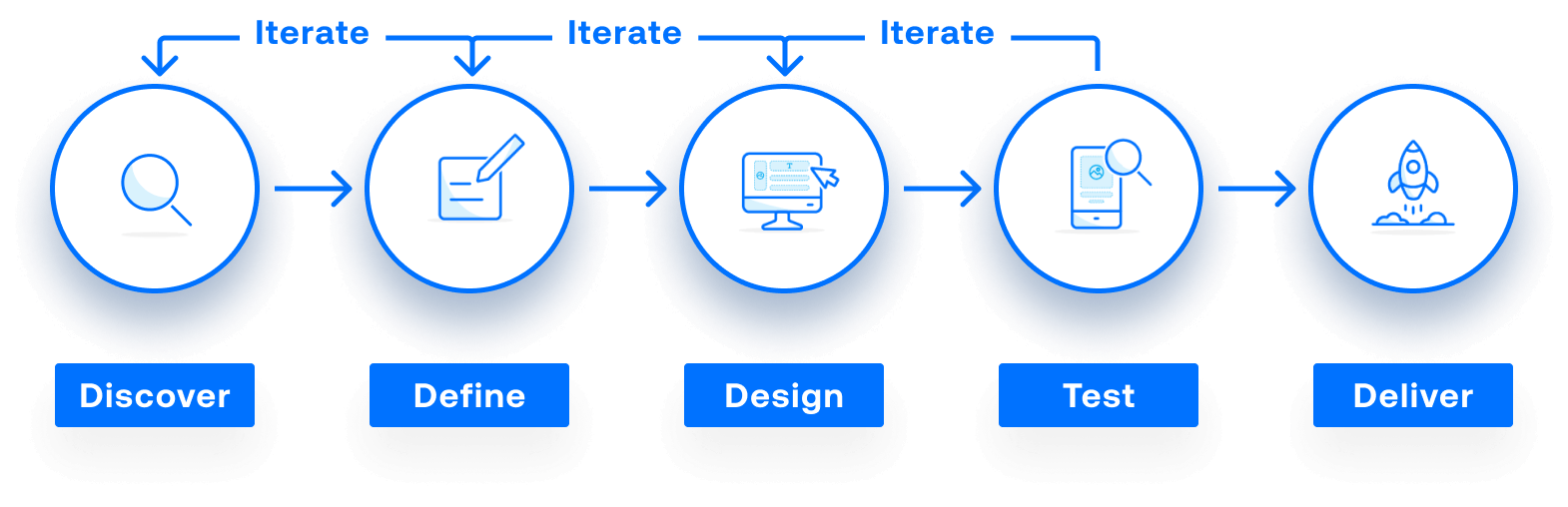
Discover
User Interviews
- Interviewed dozens of beta members
- Collected feedback and discussions with Community Managers
Research Findings
Students want to use new knowledge, engaged in live events, and deemed member directories essential.
Online Surveys
- Looking to discover key pain points, wants, and needs
- General feedback and student input
Research Findings
Members are excited about the membership platform, want high-value learning, are optimistic but cautious about change, and want familiar features to be maintained.
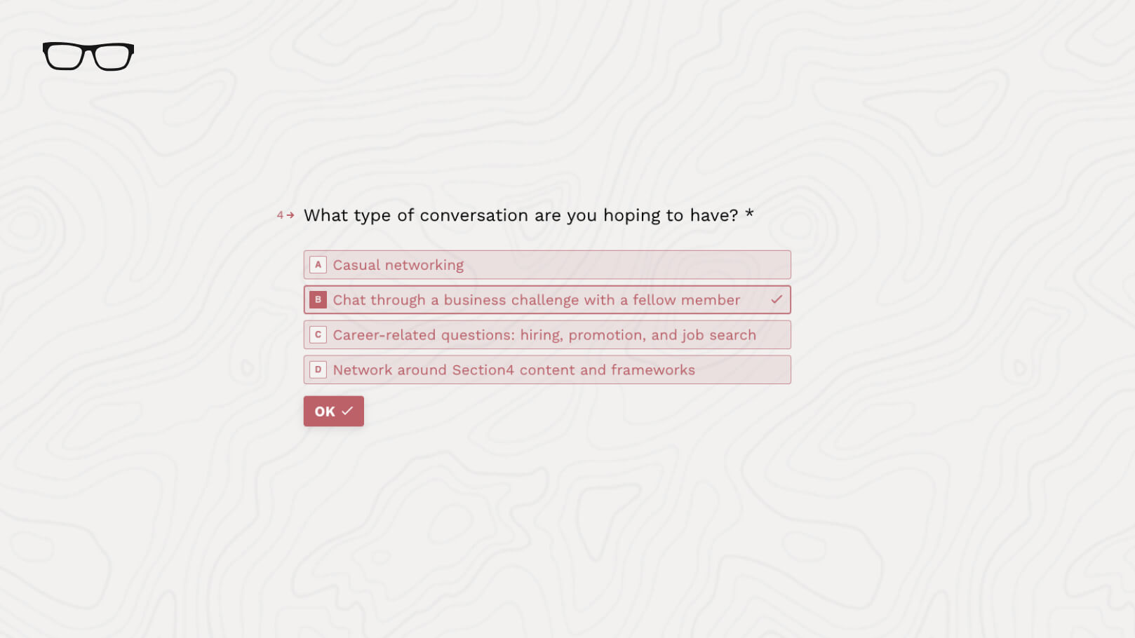
Typeform was Section4's tool of choice for online data collection
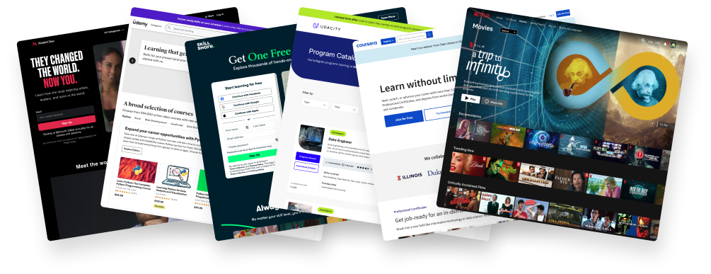
A few of Section4 competitors
Competitive Analysis
- Looked at 10+ competitors in the ed-tech space
- Visual design and UX research
Research Findings
Masterclass platforms were praised for unique instructors, positive onboarding, and pleasing video experience, while platforms like Udemy and Coursera were criticized for being overwhelming and similar. Netflix was praised for well-organized content, minimal text, and easy scrolling.
Student Needs
Looking for more content, connection, and opportunities for learning during and between Sprints (courses.)
Students were creating their own Slack groups and there was no usage data transparency.
In order to improve the overall user experience for our students, we needed to collect data.

Feature Prioritization
Our Team used FigJam to organize our feature prioritization sessions. It helped the development team focus on creating the most valuable and useful experience for the user, rather than wasting time and resources on features that may not be as important.
The Challenge
Leadership, outside of the product team, tended to overrule our feature prioritization with their own agenda.
Solutions
- We involved leadership stakeholders in the feature prioritization process from the beginning.
- We invited them to participate in user research, customer interviews, and other forms of data gathering, so they could gain a deeper understanding of user needs and preferences, which helped to align their priorities with those of the users.
- We established clear criteria and metrics for evaluating the importance and impact of different features. This helped to ensure that decisions were based on objective data, rather than subjective opinions, which was more difficult for leadership to argue with.
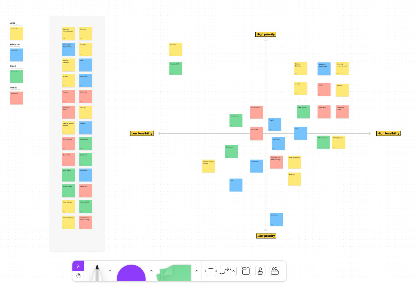
FigJam prioritization workshop
Product Roadmap
The product roadmap was primarily managed by the Project Manager and Head of Product, but as a member of the UX team, I actively contributed and provided design feedback based on my knowledge of daily tasks and development constraints.
Research Findings
This helped to ensure that the product vision was aligned with user needs and the development team's capabilities, and that the product was delivered on time. My participation in the product roadmap process helped to ensure that the final product was user-centered, and that the design and development work were aligned with the overall strategy and goals of the product.
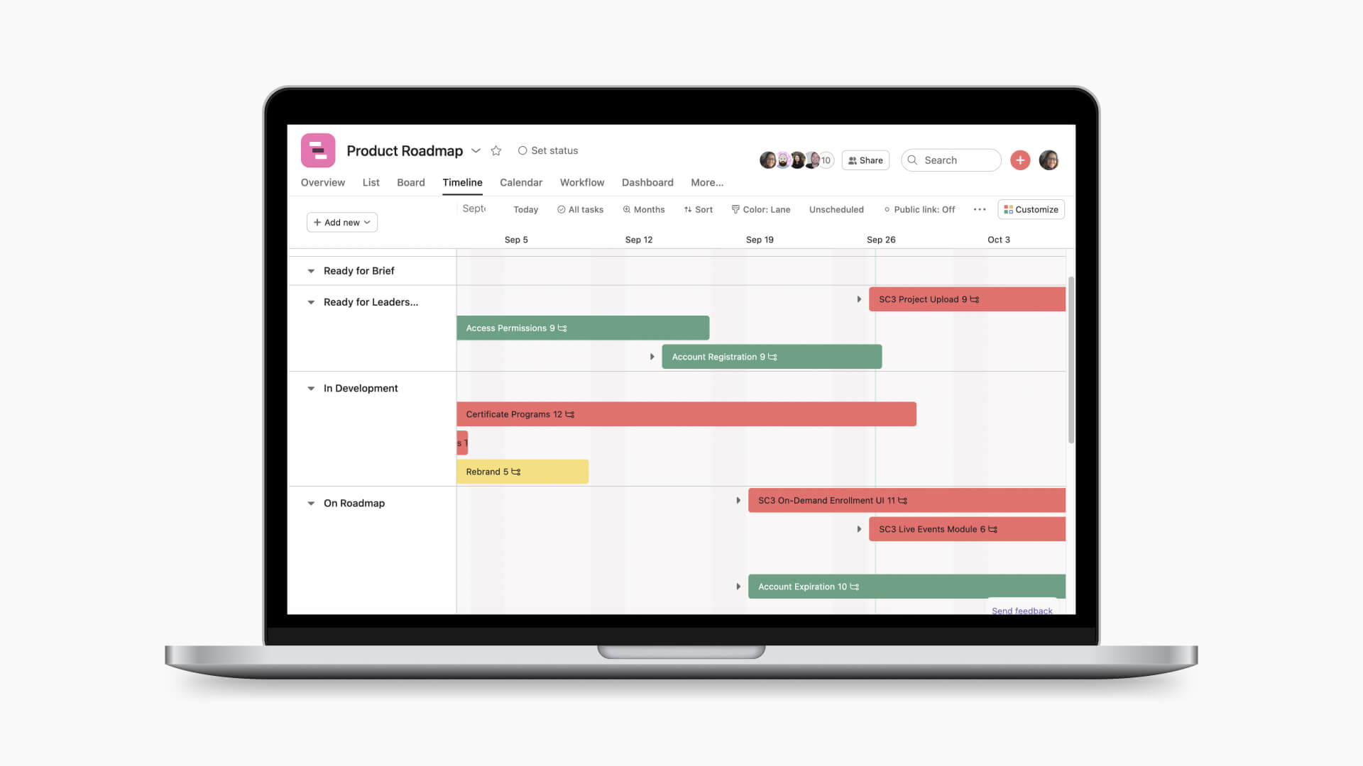
Asana Roadmap
Define
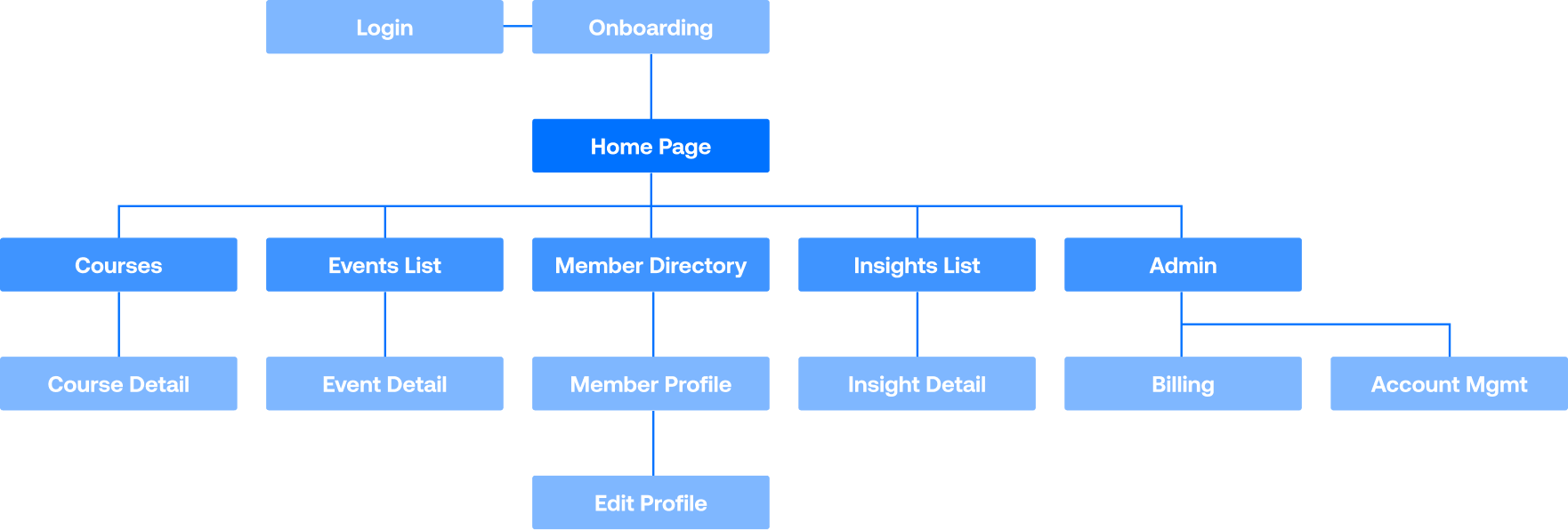
Information Architecture
- Courses - A place for members to see upcoming courses, enrolled courses, and past courses. This also became a place to view on-demand content.
- Events - The user can view upcoming live and past events. They can also dive into an event detail to RSVP to attend, read about the event and host, and add it to their calendar.
- Members - Members can browse other members and search by name, job title, and company name. They can also view other members’ profiles and connect through LinkedIn.
- Insights - Deliver bite-sized, high-value learning moments through case study videos.
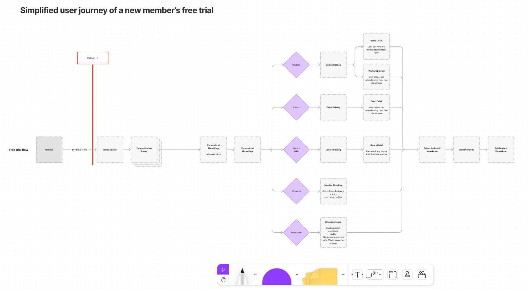
New member free trial user/task flow
Free Trial Flow
Created task and user flow diagrams to help figure out the most efficient path for a variety of different tasks.
New Member Journey Map
I employed the use of comprehensive user journey maps to gain valuable insight into the user's experience throughout their interactions with the product. By mapping out the user's needs, goals, pain points, and emotions at each stage of the journey, I was able to provide the design team and stakeholders with a clear understanding of the user's perspective. This information was then utilized to pinpoint areas for improvement and to inform the design of solutions that effectively addressed the user's needs.
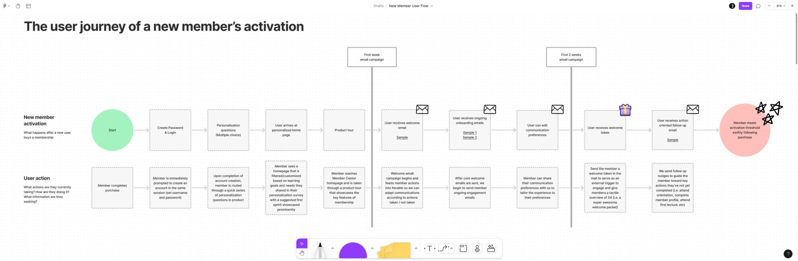
User journey of for new member activation
Design System
I chose Material UI (MUI) as the backbone of our UI design system, as it paired well with React, our front-end library, allowing for a quick market launch. MUI and React provided a reliable, efficient and flexible framework for building user interfaces and allowed our team to focus on creating a great user experience while iterating quickly. MUI also gave our product a consistent and professional look and feel and ensured accessibility standards were met.
What I learned
While MUI can be a great choice for larger products, it might be too much for a small product.
One of the main reasons for this is that MUI comes with a significant amount of pre-built components and functionalities, which can be overkill for small products that require only a limited set of features. These pre-built components and functionalities can make the development process more complex, and require additional resources to implement and maintain.
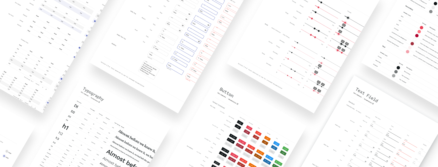
Custom Material UI design system
Design
Home Wireframes
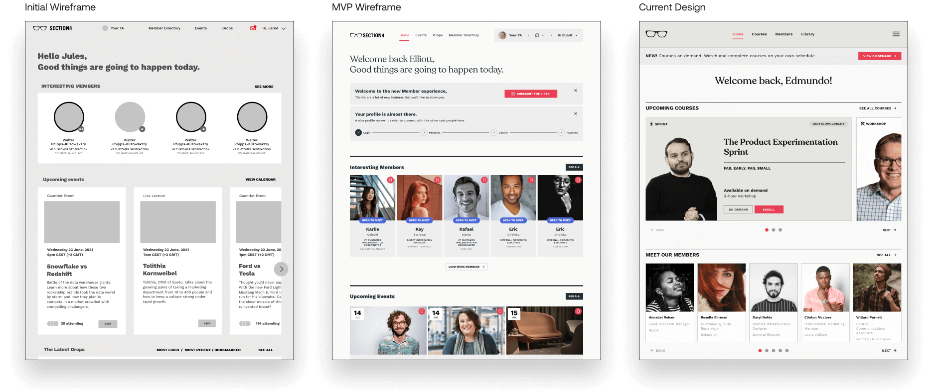
Home Page evolution
Courses Wireframes
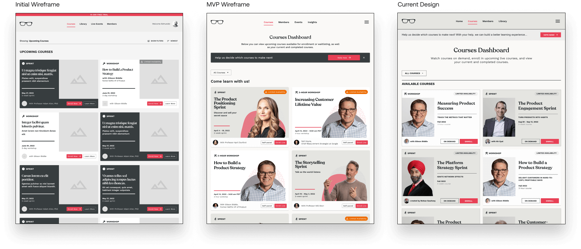
Courses Page evolution
Event Detail Wireframes
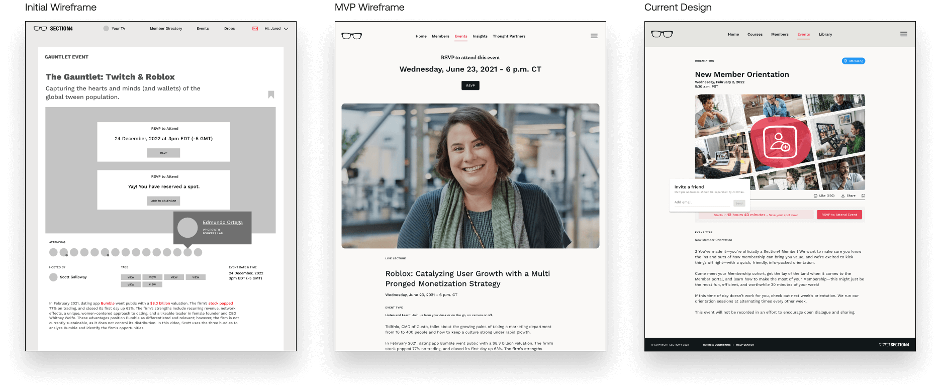
Event Detail Page evolution
Rapid Prototyping
I used rapid prototyping to quickly create and test ideas, improving product quality through early testing and design validation. I applied this method to almost every feature, reducing development time and costs by identifying and addressing problems early. It also increased design efficiency and allowed for quick iteration based on user feedback.
Course voting prototype
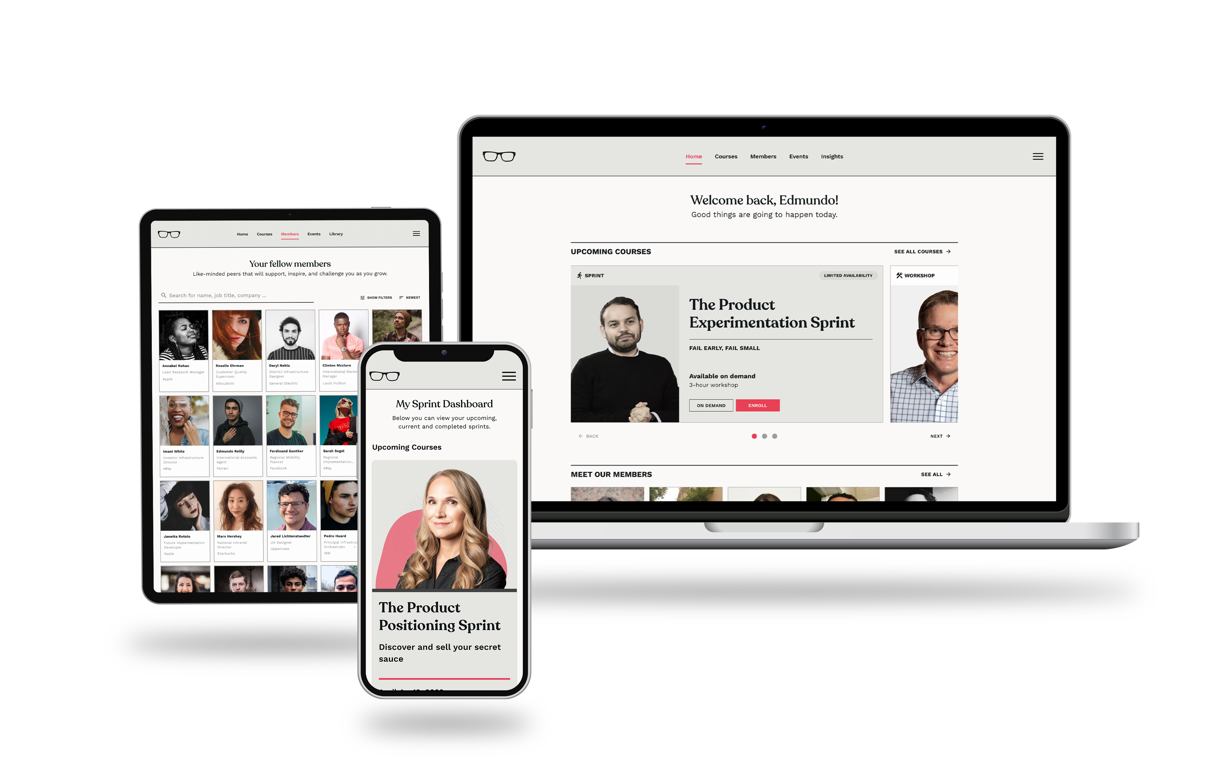
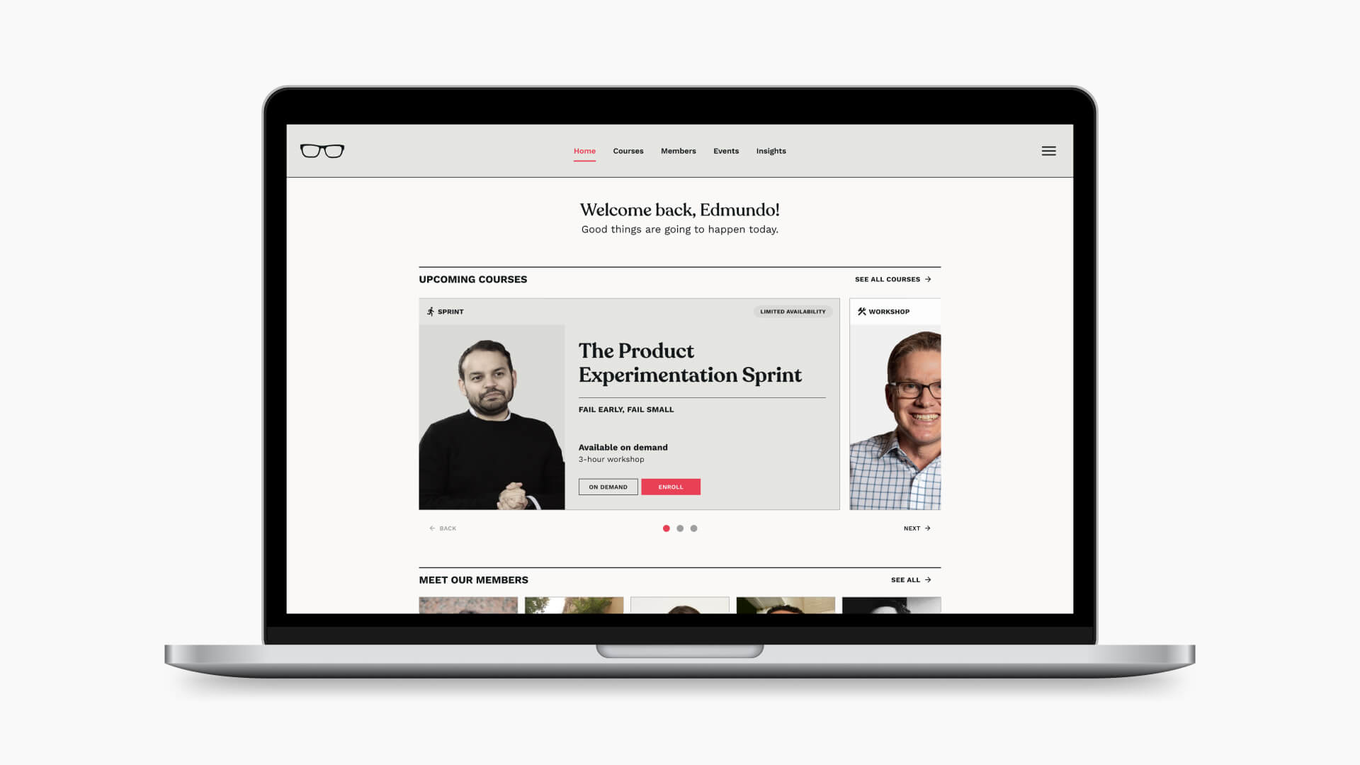
Final Member Center design
Deliver
Engineering Handoff
I redesigned our Figma team structure to help organize our team’s working and handoff process and created a new handoff file structure so our engineers knew exactly what to work on.
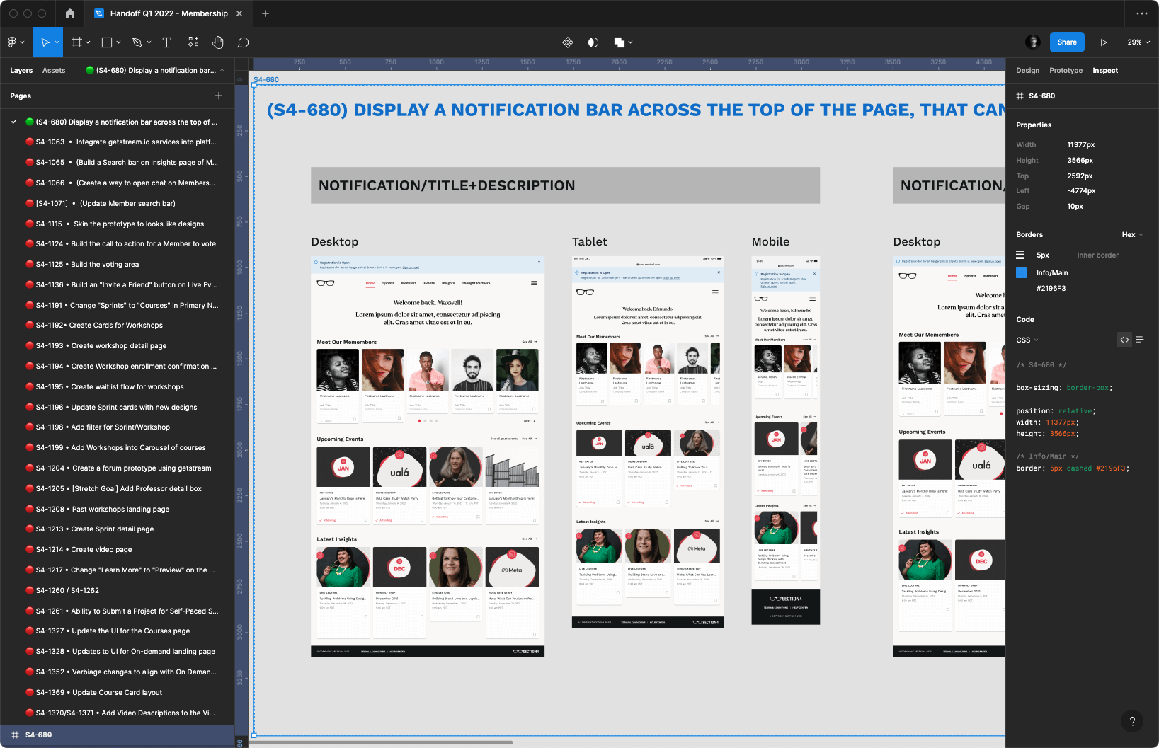
Handoff Figma file used to communicate with engineers
Results
By the numbers
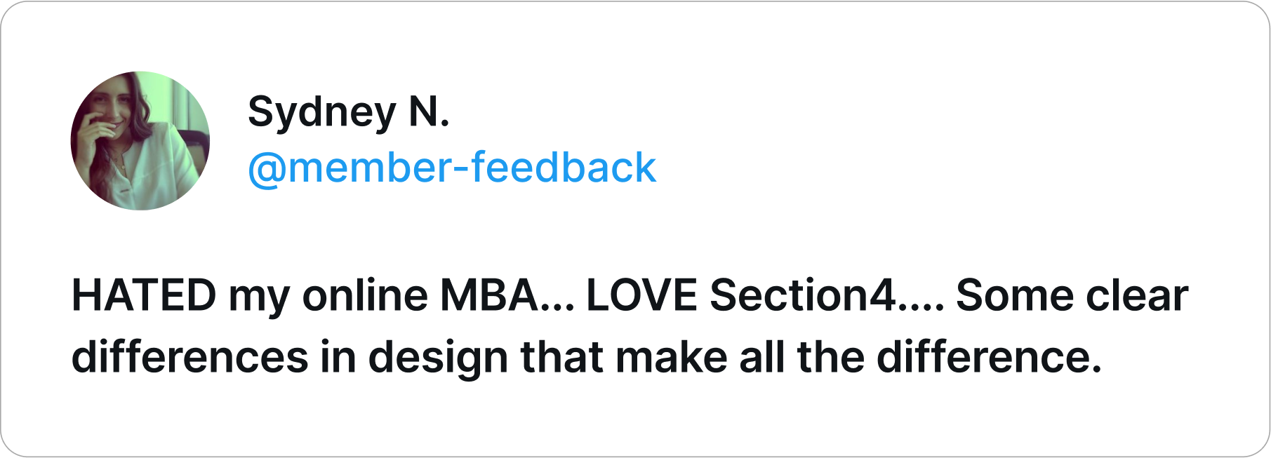
The Section4 Member Center was a great success, as it received positive feedback from members and saw continued growth and improvement with each release.
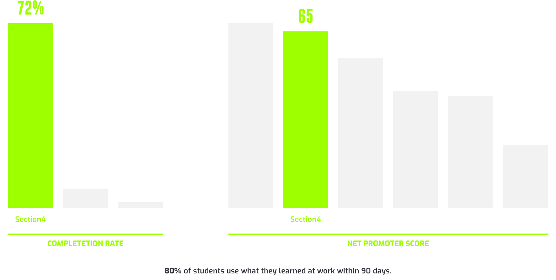
In the end, we saw engagement rates upwards of 80%, renewal rates of 82% for Beta members, and we gained over 10K new members in 9 months.
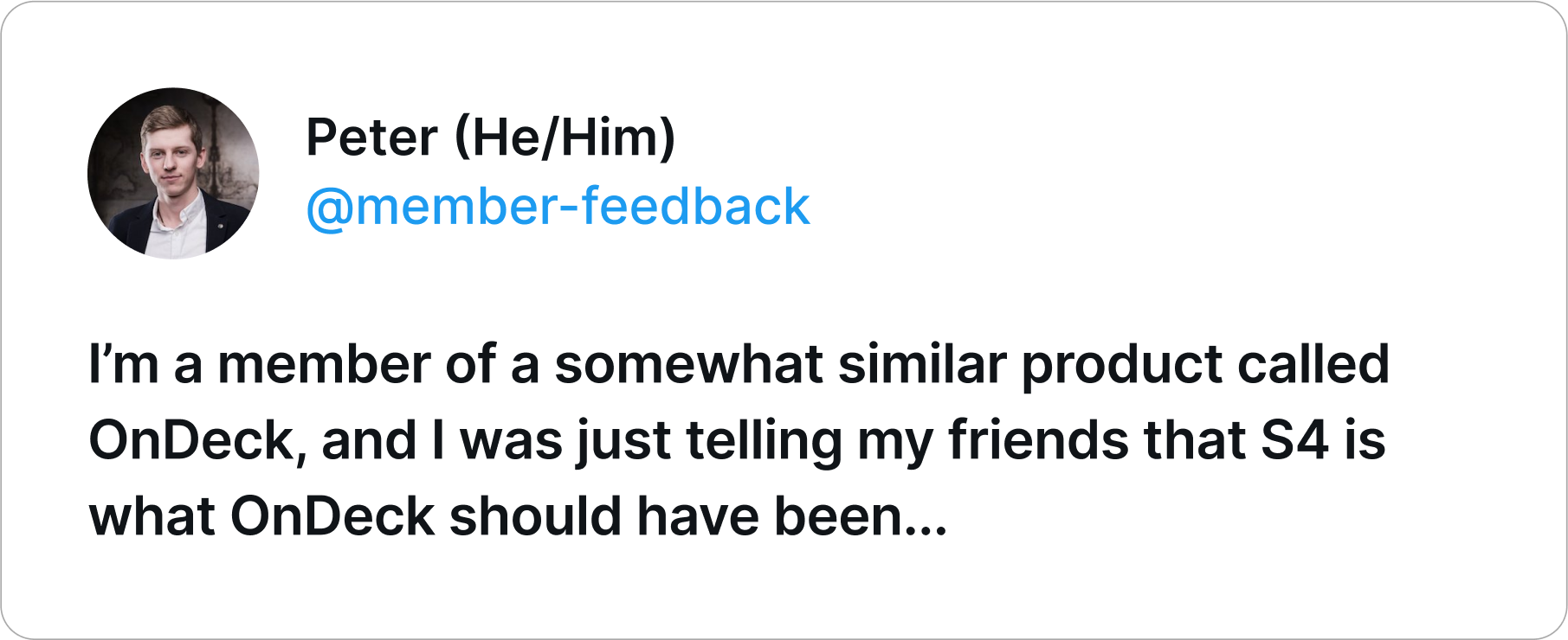
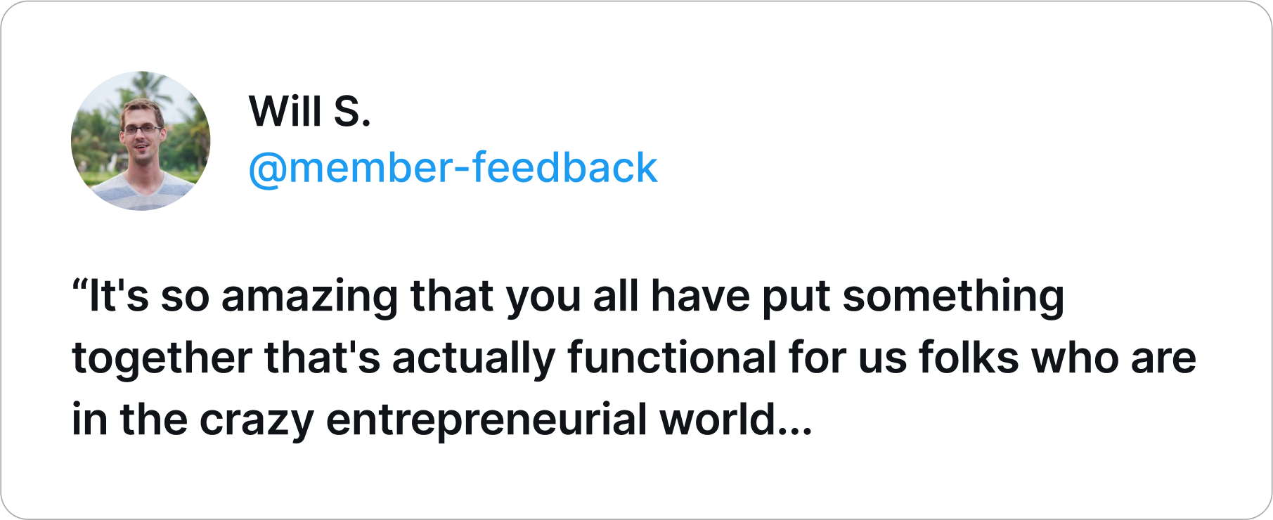
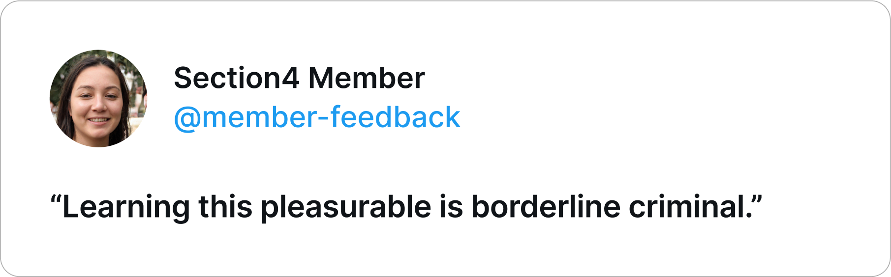
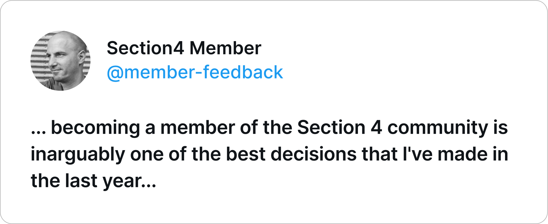
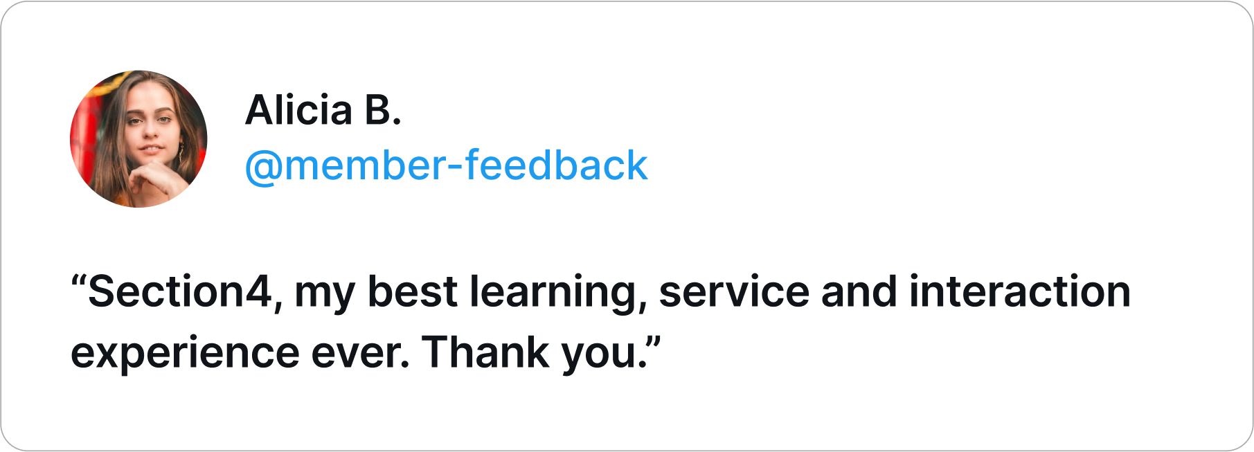
User Validation
While numbers and growth are important indicators of success, the feedback we received from students was particularly valuable to me, as it provided insight into how the membership platform was impacting their experience.