MUSEUM OF HISTORY AND INDUSTRY
Launch Pad Exhibit
Gesture and touch-driven interactive mirror
The Seattle Museum of History and Industry (MOHAI) enlisted Stimulant to design and develop an interactive wall exhibit for the new Bezos Center for Innovation. The exhibit, which is centered around the themes of innovation and collaboration, was created to inspire visitors to explore their own potential for creativity and to engage with the concept of innovation in a fun and interactive way.
My Role
As the Art Director for this project, I played a key role in guiding the visual and motion design direction. I provided feedback and support throughout the development process and helped manage and prioritize client feedback. My role involved making sure that the final outcome was in line with the project's goals and visually impactful.
The Challenge
MOHAI wanted an interactive touch wall that would inspire visitors to be innovative in their own lives and communities.
Our Solution
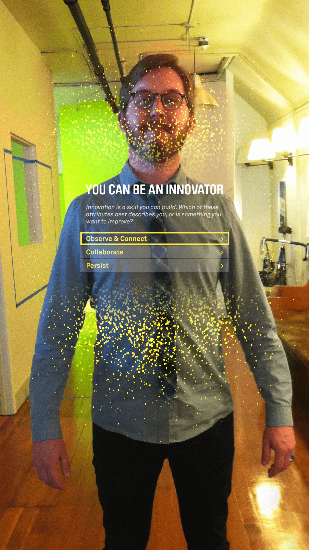
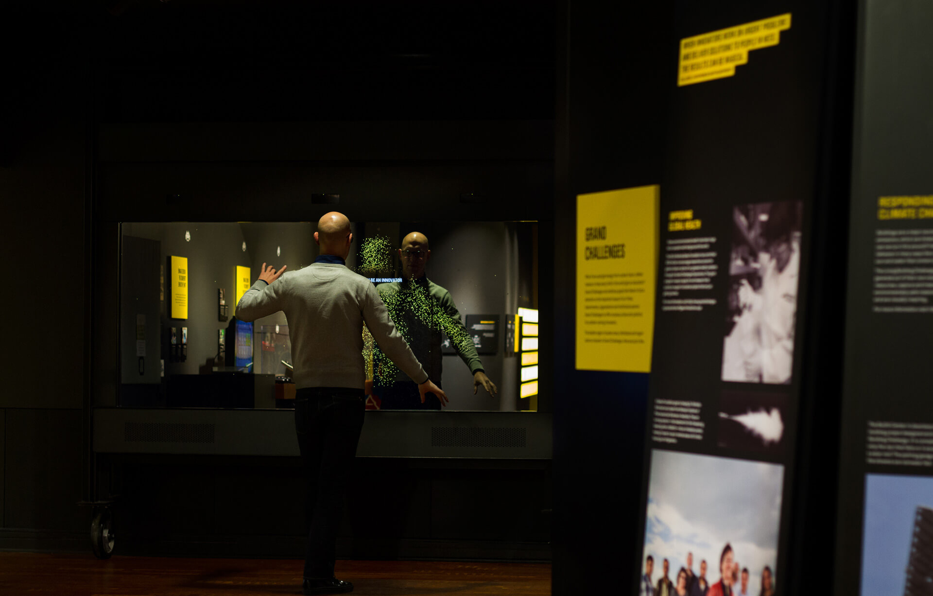
To achieve this, we designed a touch-based interface that utilizes a reactive mirror augmented by depth-sensing cameras, that follow visitors' movements with playful, spritely particles. The experience not only captures visitors' attention but also invites them to explore the exhibit and reflect on the power of innovation through collaboration.
The interactive wall serves as an impactful coda to the overall visitor experience, emphasizing that anyone can be innovative if they cultivate the right mindset.
Look & Feel
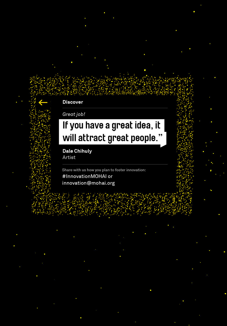
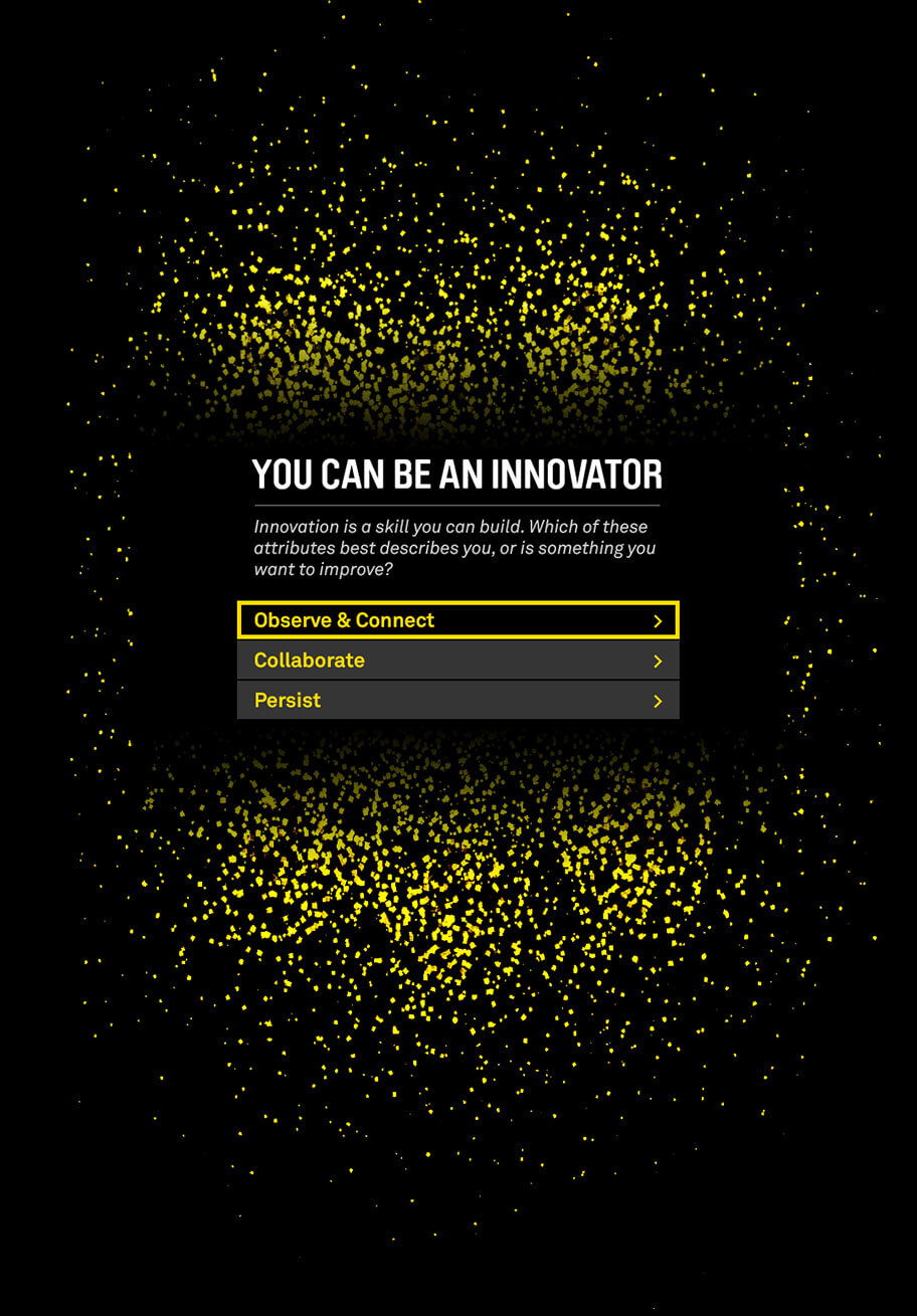
The visual style and overall aesthetic of the interactive wall exhibit were inspired by the creative direction of the exhibit design created by the architects at Olson Kundig. Their design was used as a foundation for the development of the exhibit, shaping its overall look and feel to match the overall concept and design of the innovation center.
Accessability
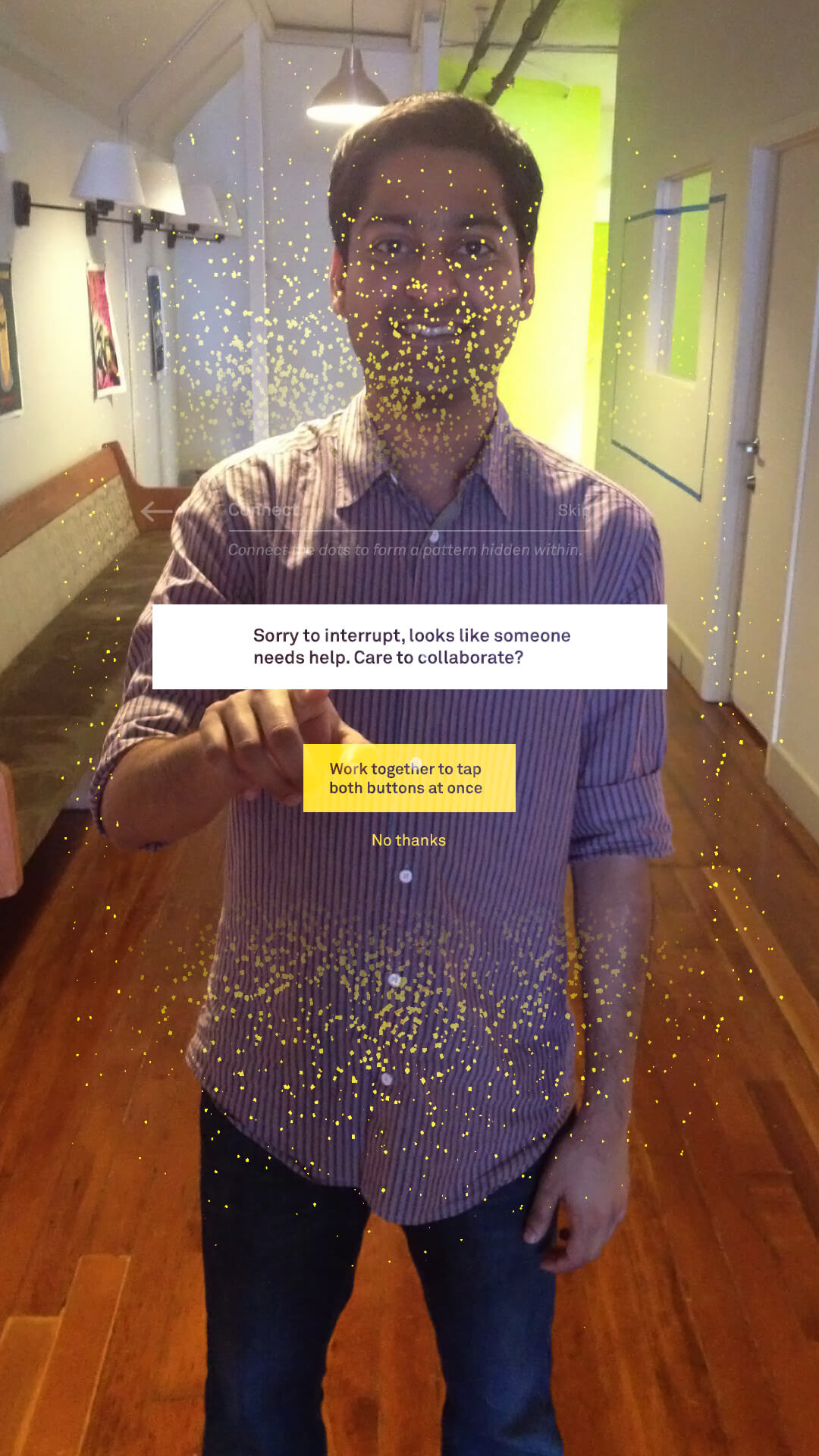
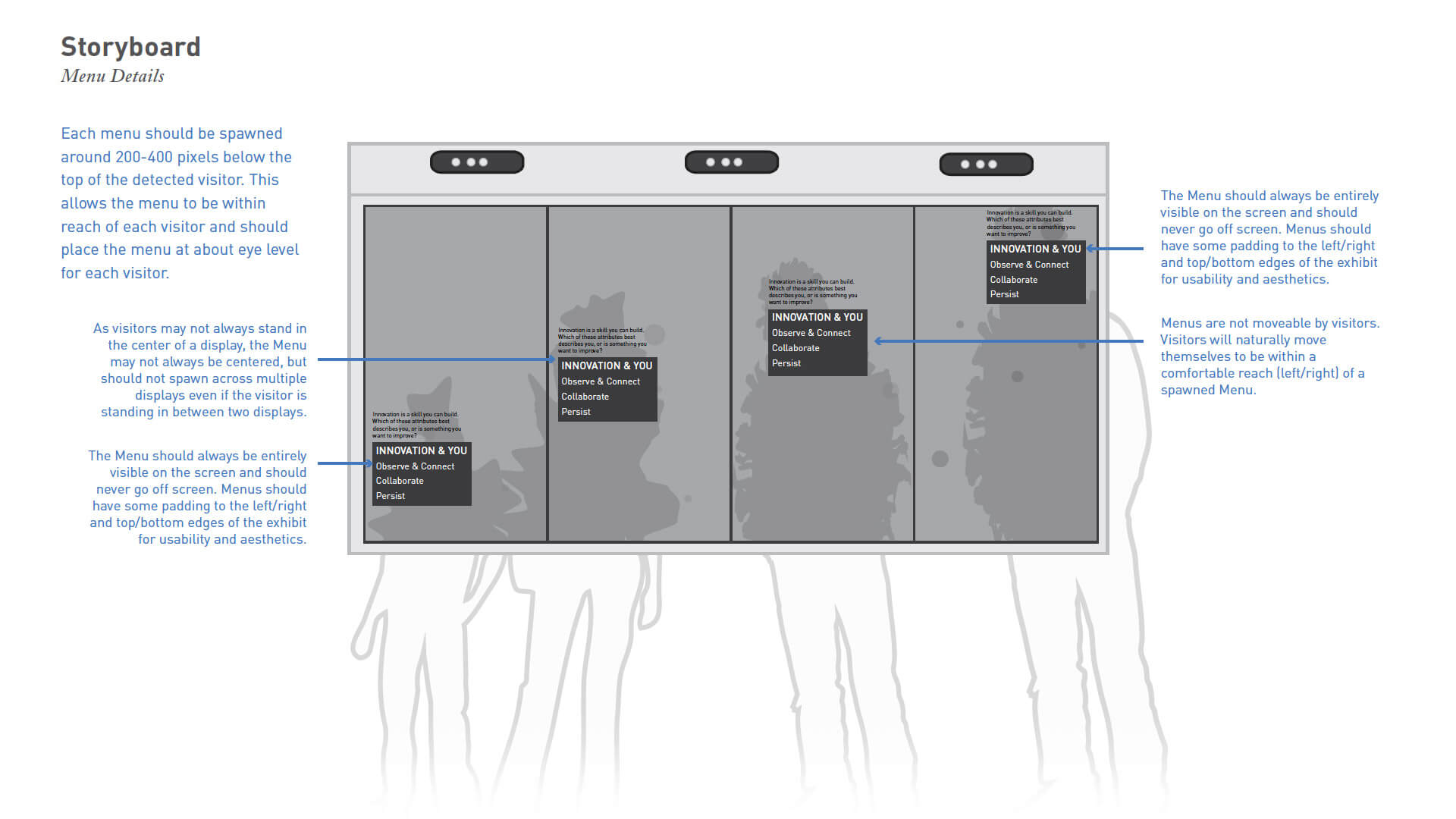
This exhibit was located in a public space where a diverse range of visitors would be interacting with it. To ensure that everyone could comfortably engage with the exhibit, we utilized depth-sensing cameras to track body movements and display them as a reactive particle system. The system also uses this technology to adjust the height of the menu system to the appropriate level for each user. Visitors are encouraged to collaborate through a series of short interactions and are rewarded with playful animations. The goal is to demonstrate that anyone can be an innovator and inspire visitors to explore their own potential for creativity.
Credit: UX Designer — John Wayne Hill (Stimulant)
Size & Contrast for Readability
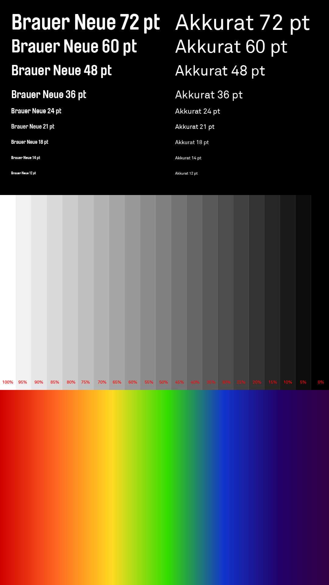
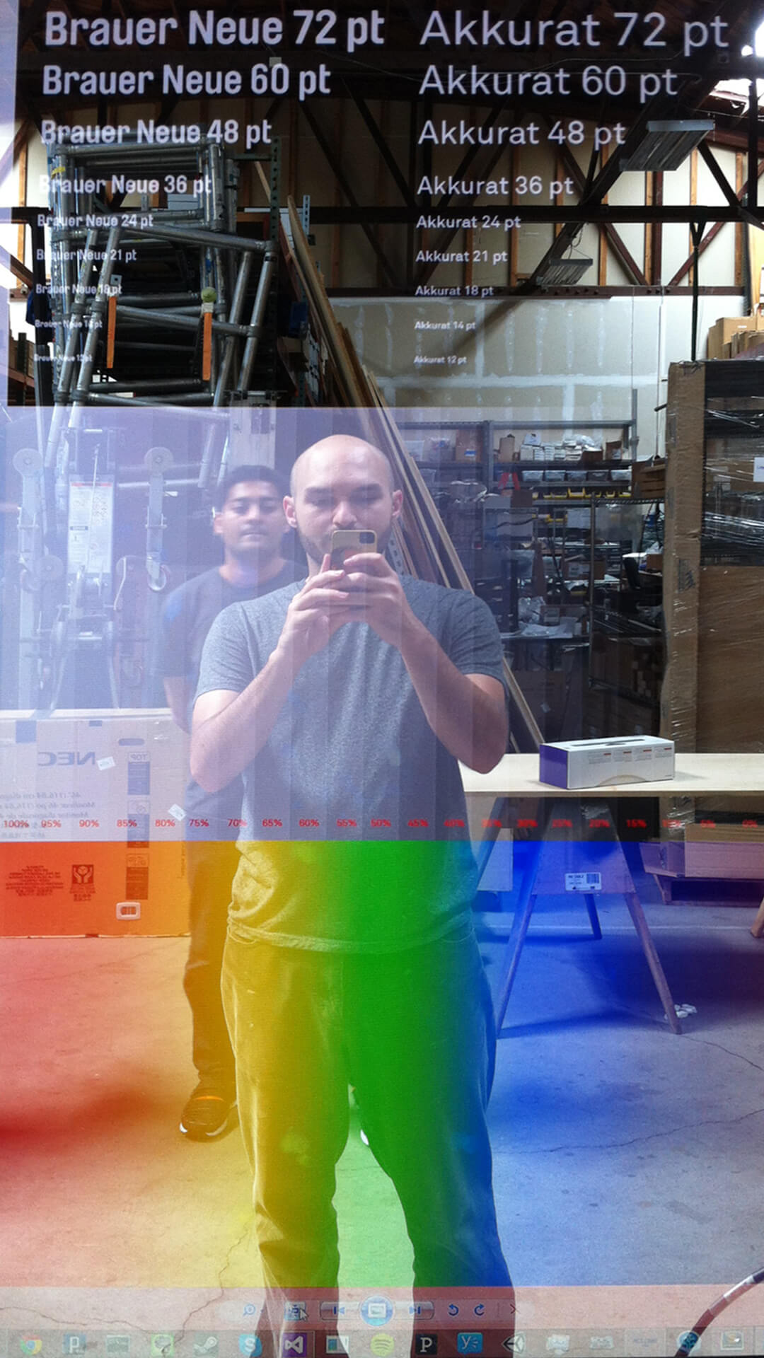
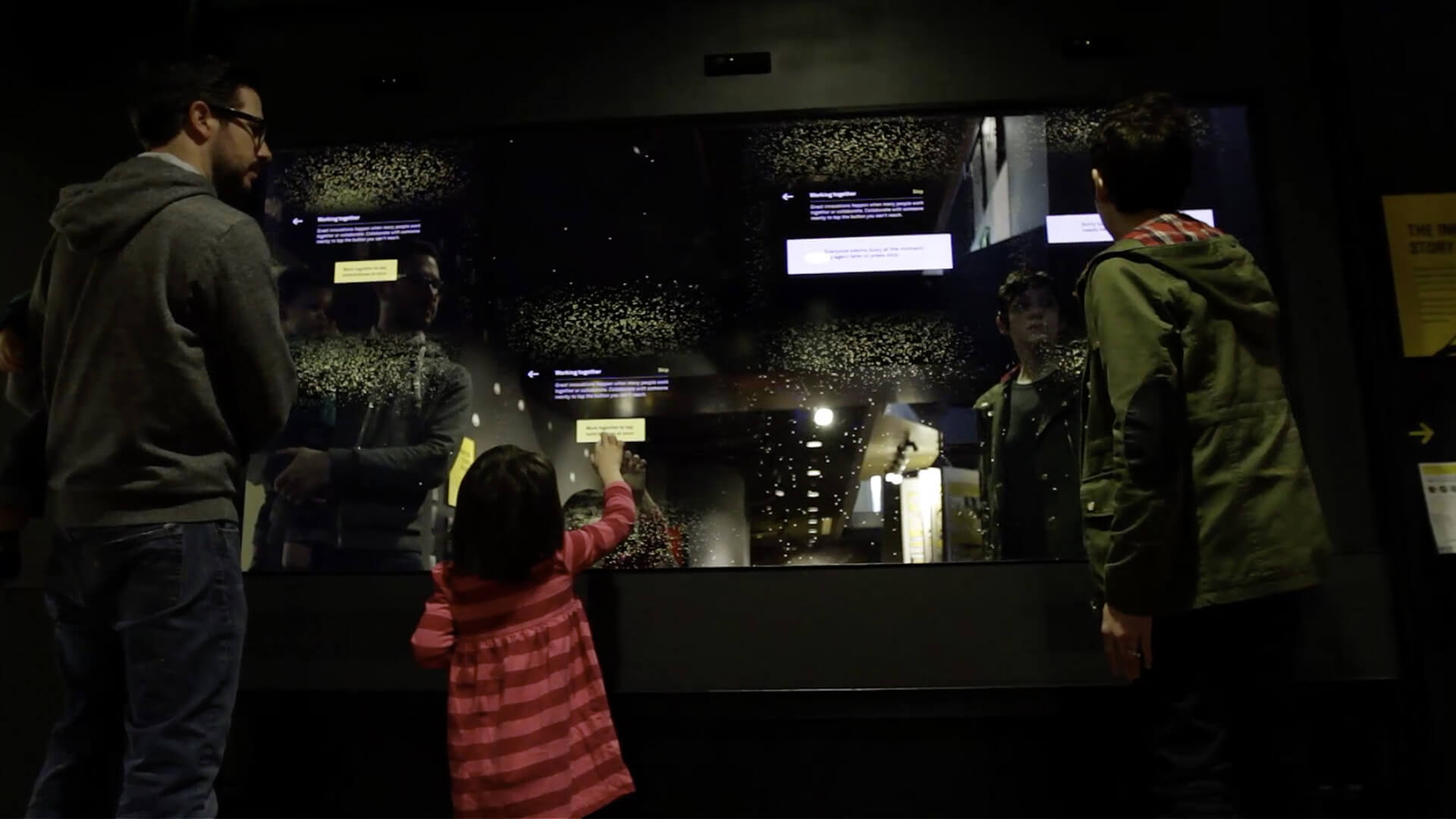
To ensure the best readability for the interface, we tested various font sizes and weights. Due to the fact that the display is a rear-projected mirrored surface, colors do not always appear as expected. We adjusted the font size and weight to find the ideal setting for the best readability. This process helped us to overcome the limitation of the display technology and provide a clear and easy-to-read interface for the visitors.
