Reunion Tower
Multi-user touchscreen application and generative art
Reunion Tower, an iconic structure in the Dallas skyline since the 1970s, was in need of revitalization. The world-renowned architectural firm, Gensler, was brought on board to lead the redesign of the building's interior. As a digital design and development company, Stimulant was enlisted to help bring Gensler's vision to life by creating digitally enhanced interactive environments in the lobby, the observation deck, and Cloud9 - the 5-star restaurant at the top.
Our goal was to create a unique and memorable experience for visitors, combining the latest digital technology with Gensler's exceptional design expertise to create an immersive and interactive environment that complements the tower's historical significance.
My Role
As the Art Director and sole Visual Designer for this project, I played a multifaceted role. My main responsibilities included creating the overall aesthetic and animation for the project. Additionally, I collaborated closely with our UX Designer, internal stakeholders and the client to develop the concept and ensure that our work was seamlessly integrated with the interior design that was being developed simultaneously. I also provided direction to the development team during the build phase and worked collaboratively with photographers and video teams to achieve the desired visual outcome. My role was key in bringing the project's vision to life and creating a cohesive and visually impactful user experience.
The Reunion Tower
The Geo-deck
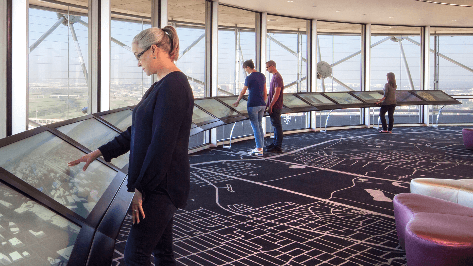
The GeO-Deck features two Halos that can accommodate up to 30 users simultaneously. These Halos offer interactive 3D backgrounds that respond to touch and movement and support a variety of content including 3D models, photos of Dallas landmarks, gigapixel panoramas, control of HD cameras for exploring the city, custom maps, a video about the JFK assassination, and an interactive simulation of the tower's light shows. Each display is tailored to its specific location on the deck, but all content can be accessed from any station. The GeO-Deck is an observation level located 470 feet above the ground, offering a panoramic view of the Texas landscape.
My Role
I was responsible for creating the overall aesthetic for the attract state and all five sections of the Halo. In collaboration with the Gensler design team, I seamlessly integrated the physical space into the digital experience to provide a cohesive and unified guest experience.
Geo-deck
The Halo
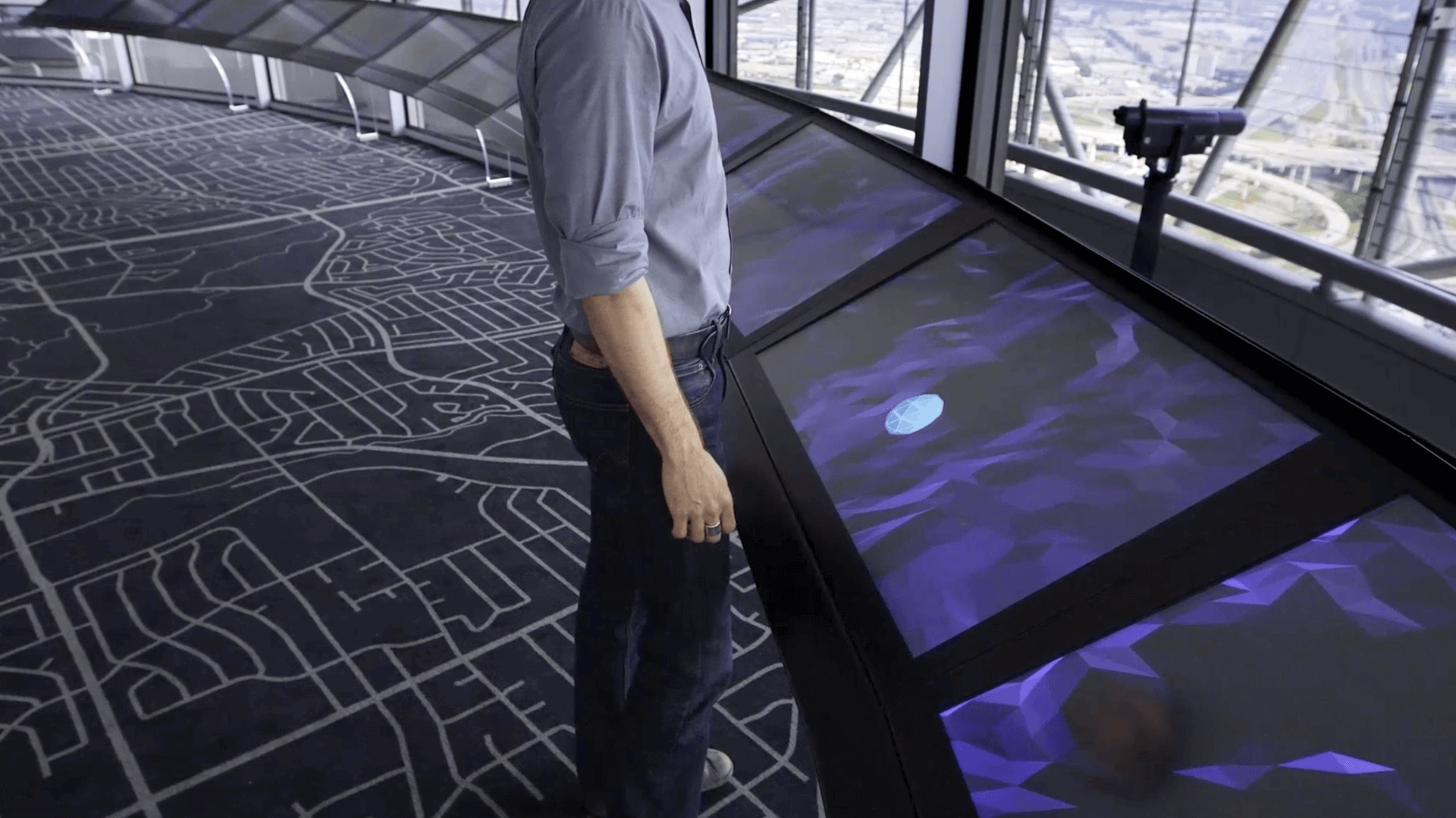
The Halo is an arc of 15 seamlessly-integrated displays linked together to create a massive 60-foot-wide reactive and interactive surface.
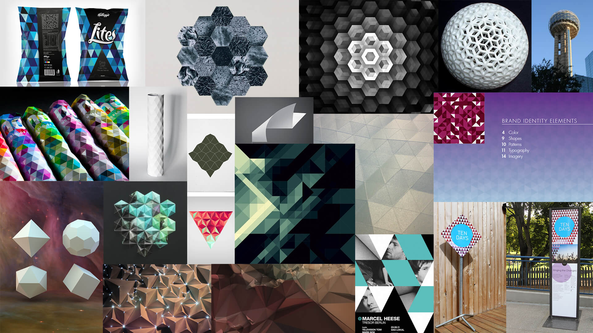
Mood Board
This mood board was curated to reflect the interior design elements of the space, with a focus on geometric shapes and tessellated triangles, as well as the exterior of the tower. The chosen images were intended to inspire the user interface and background landscape of the Halo's digital interface, in alignment with Gensler's design concept.
Prototyping
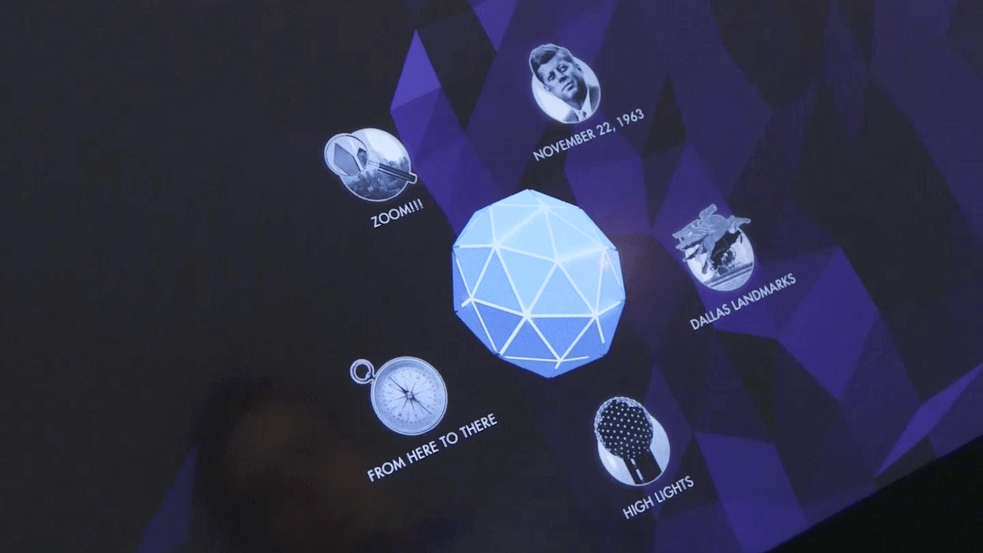
I thoroughly tested the background and spherical menu using Cinema 4D and After Effects before directing the development team. The design of the menu was inspired by the iconic sphere of Reunion Tower and it was designed to open and close with touch interaction. When open, it would reveal a set of 5 icons, each representing a unique experience for visitors to learn more about Dallas and the surrounding area. The tests I conducted helped guide the development process.
Geo-deck
The Zoom Experience
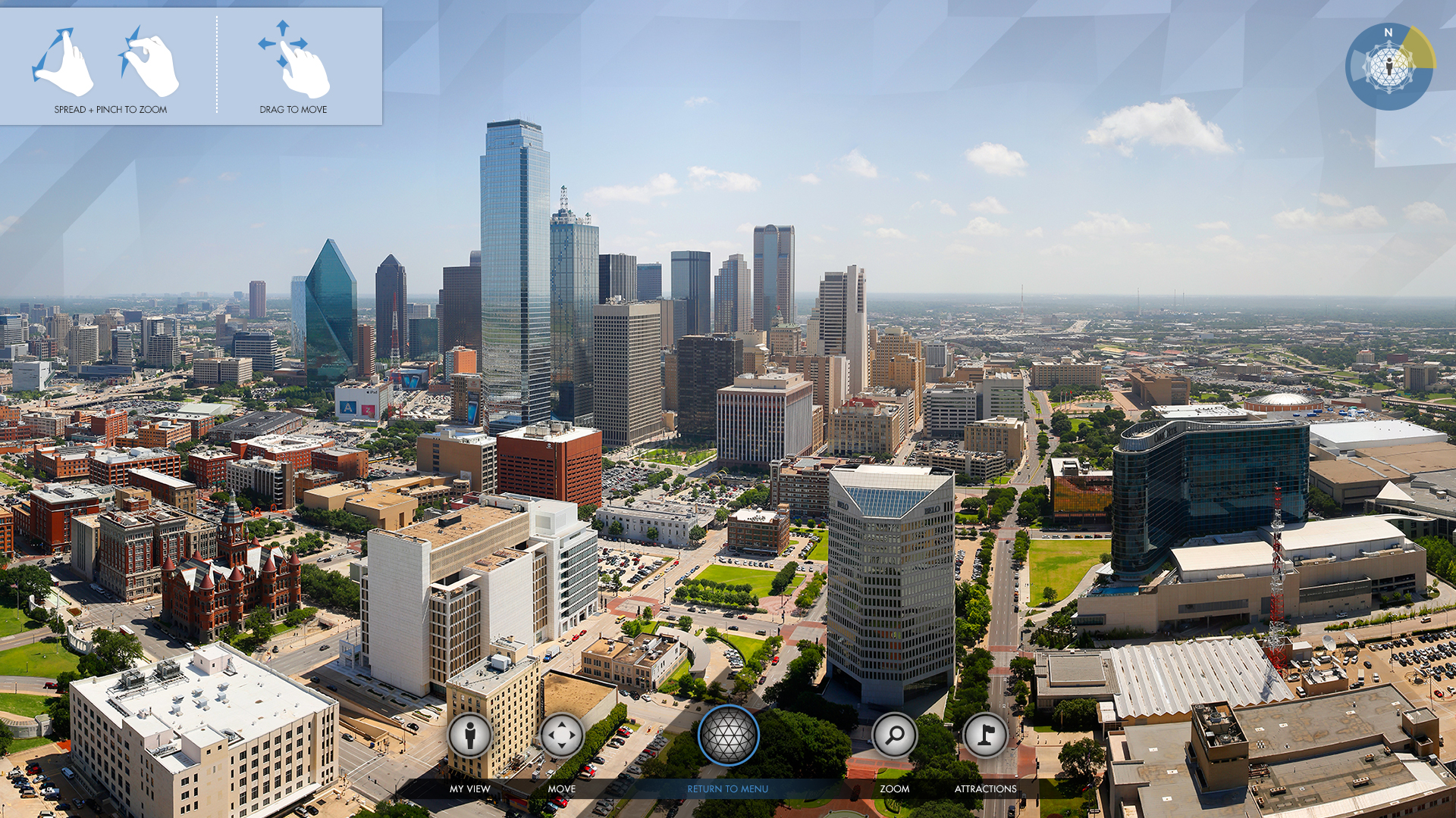
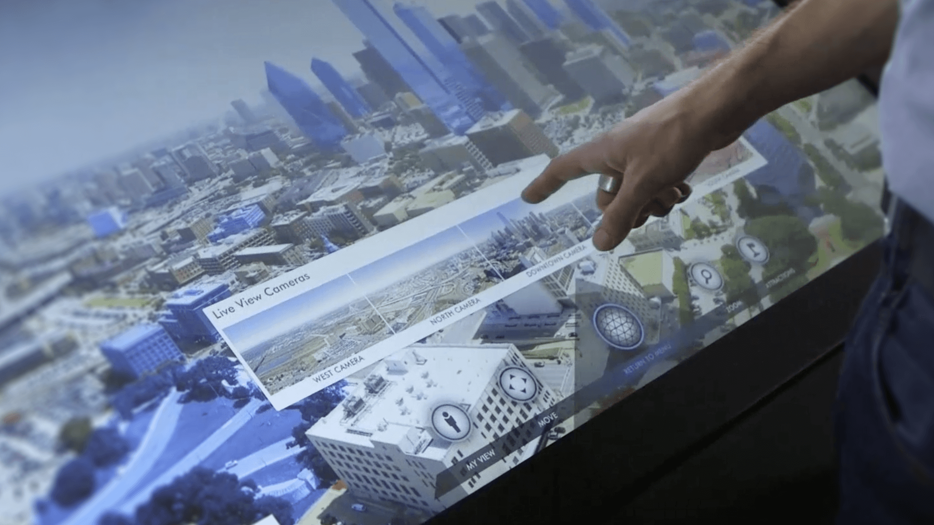
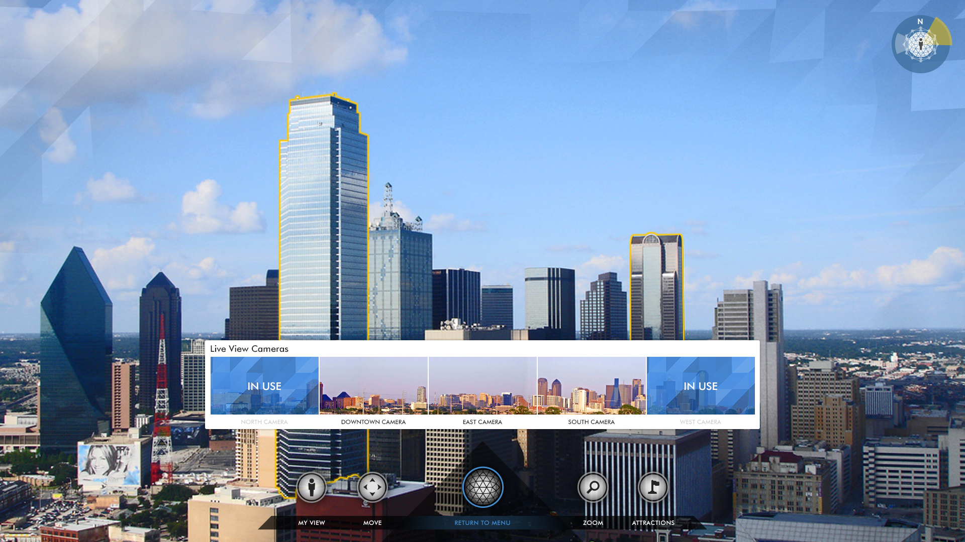
The "Zoom" section on the Halo allowed visitors to explore a 360° giga-pixel image of Dallas taken from the top of the tower and pan and zoom around the image. Additionally, visitors could take control of one of five high-definition live cameras mounted on the exterior of the tower to view the city in real-time.
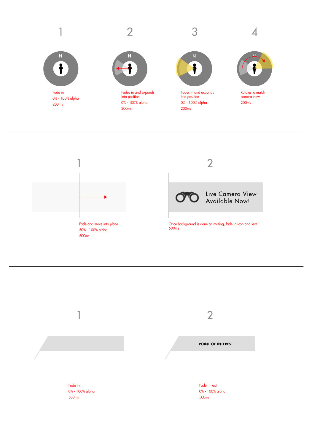
Story Boards
I created a rough storyboard to communicate my ideas for the animations. This was just one of several examples I provided to the development team.
Geo-deck
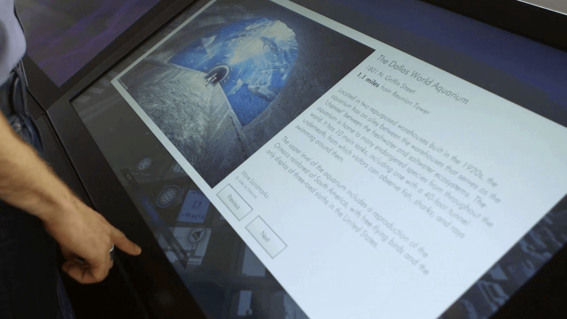
Dallas Landmarks
The Dallas Landmarks experience allows visitors to virtually visit the area's landmarks. By tapping on the screen, users can be flown from the tower to their chosen landmark and see its location in relation to the Reunion Tower.
Geo-deck
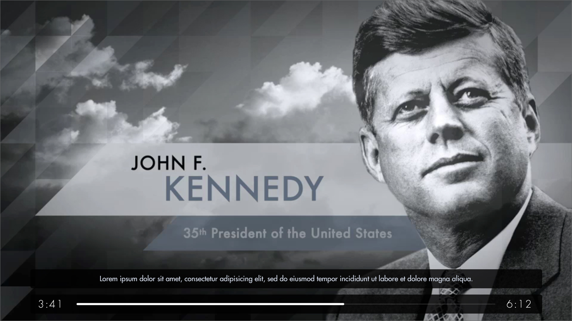
November 22, 1963 — JFK Video
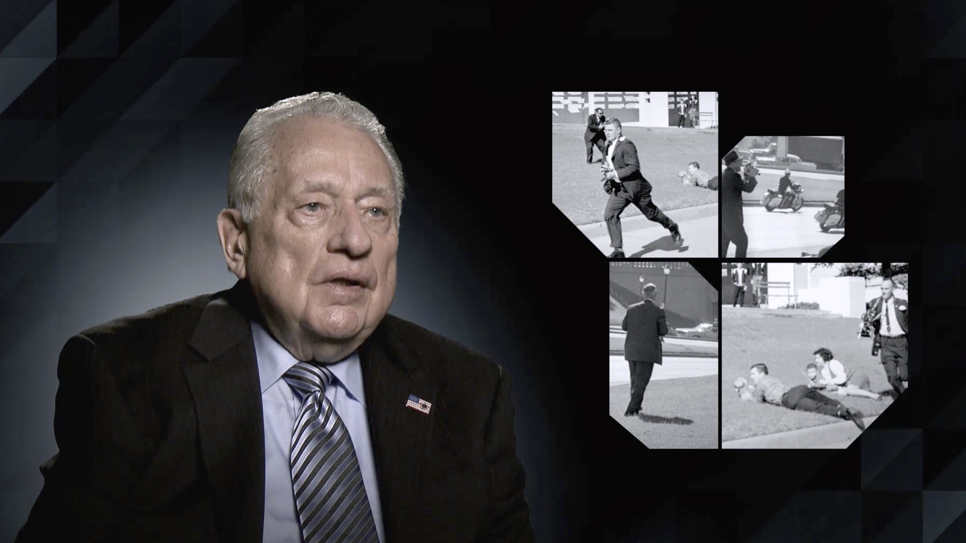
The video in the Halo experience focuses on the assassination of President John F. Kennedy, which occurred on November 22, 1963, about 50 yards from the base of the Reunion Tower. The video features previously unreleased footage and interviews with one of the last surviving Secret Service agents who rode with the president on that day. I was responsible for creating the user interface for the video and art directing the studio, L.Inc Design, that produced the video.
Geo-deck
High Lights
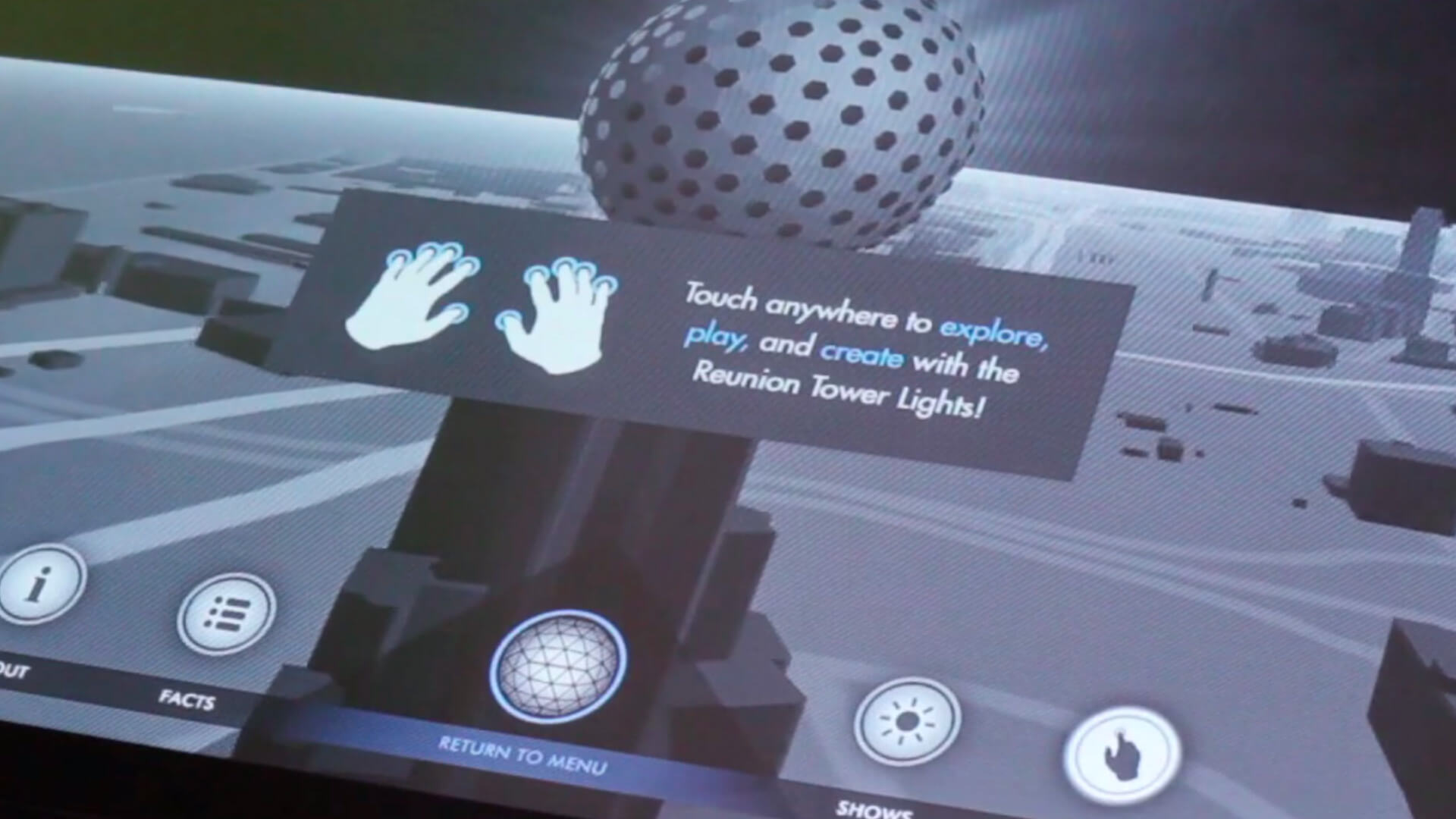
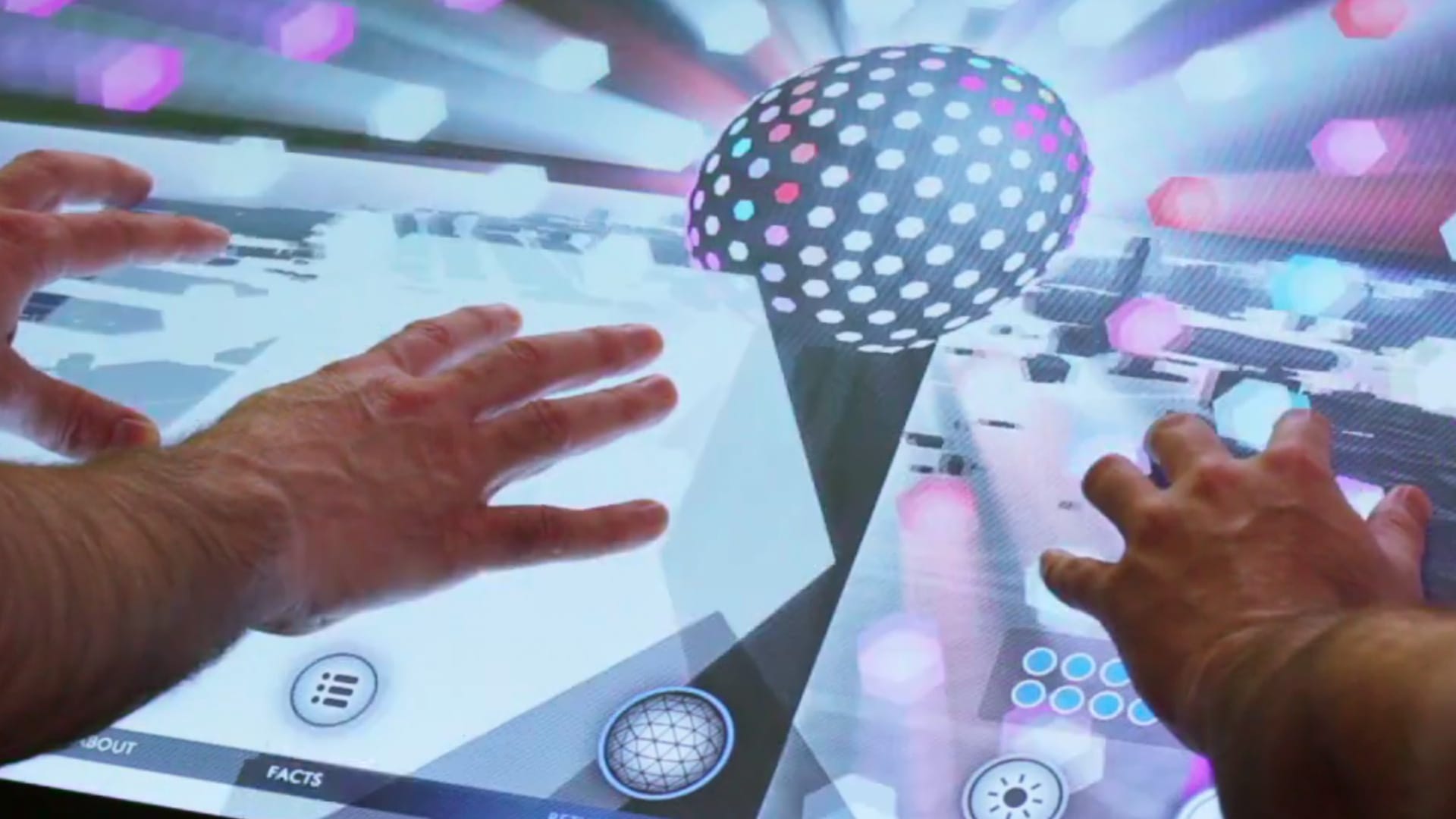
The Reunion Tower is known for its variety of light shows that complement events such as Valentine's Day, Christmas, and sporting events. To bring this aspect into the app, the High Lights experience was created, which allows visitors to create their own light shows by touching the screen. Using 1-10 fingers creates different lighting effects on a 3D model of the tower. With another person, even more, light shows can be created and an easter egg is added when a total of 20 fingers are detected.
Lighting Map
The lighting engineer for the tower provided us with a schematic (as shown below) to illustrate the wiring of the lights. We utilized this data to create our lighting sequences.
Proof of Concept Models
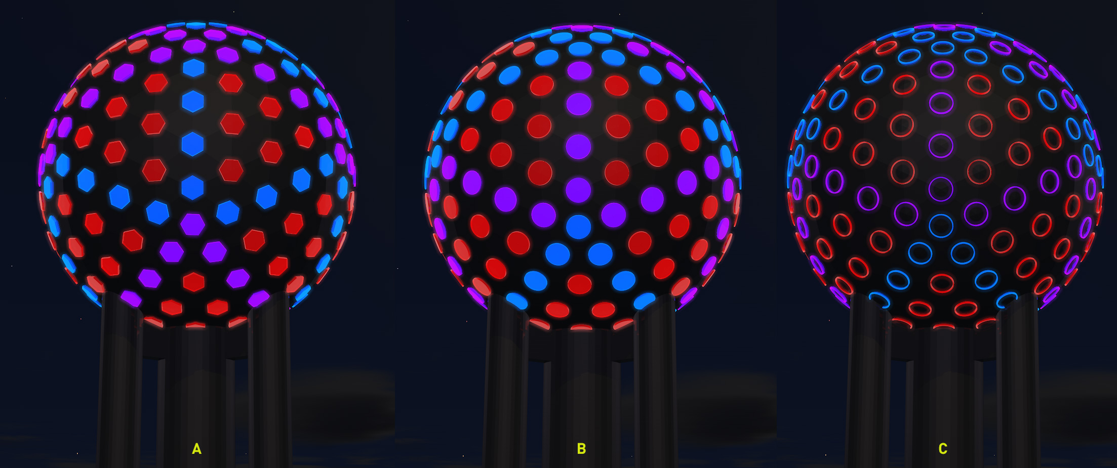
With the help of the lighting map, I developed an accurate lighting model to test different options for the lighting textures.
Testing Interactivity
With the help of the lighting map, I developed an accurate lighting model to test different options for the lighting textures.
Reunion Tower
Big Sky at Cloud 9
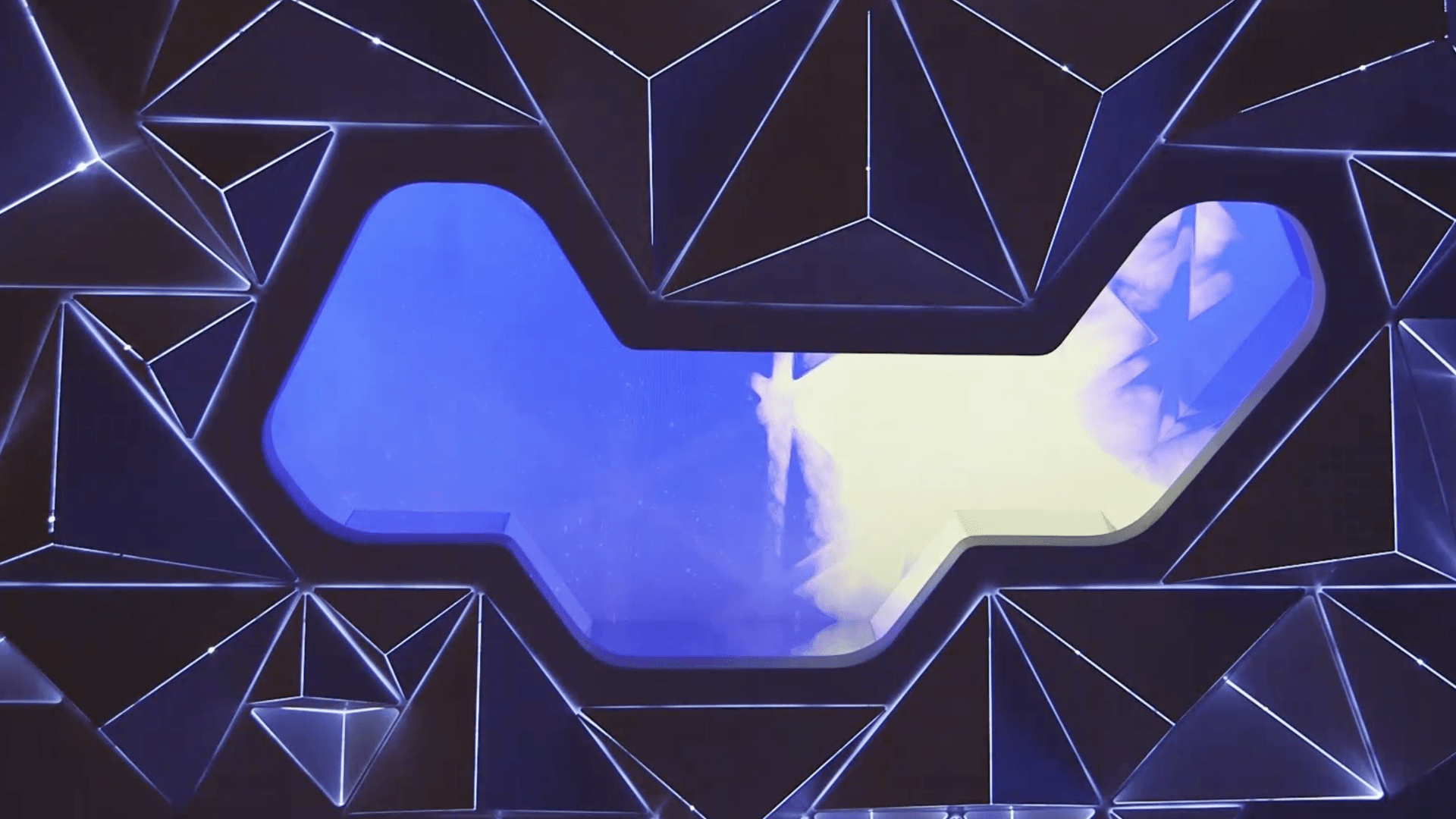
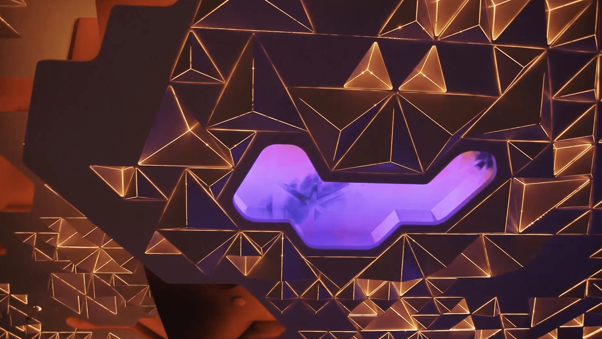
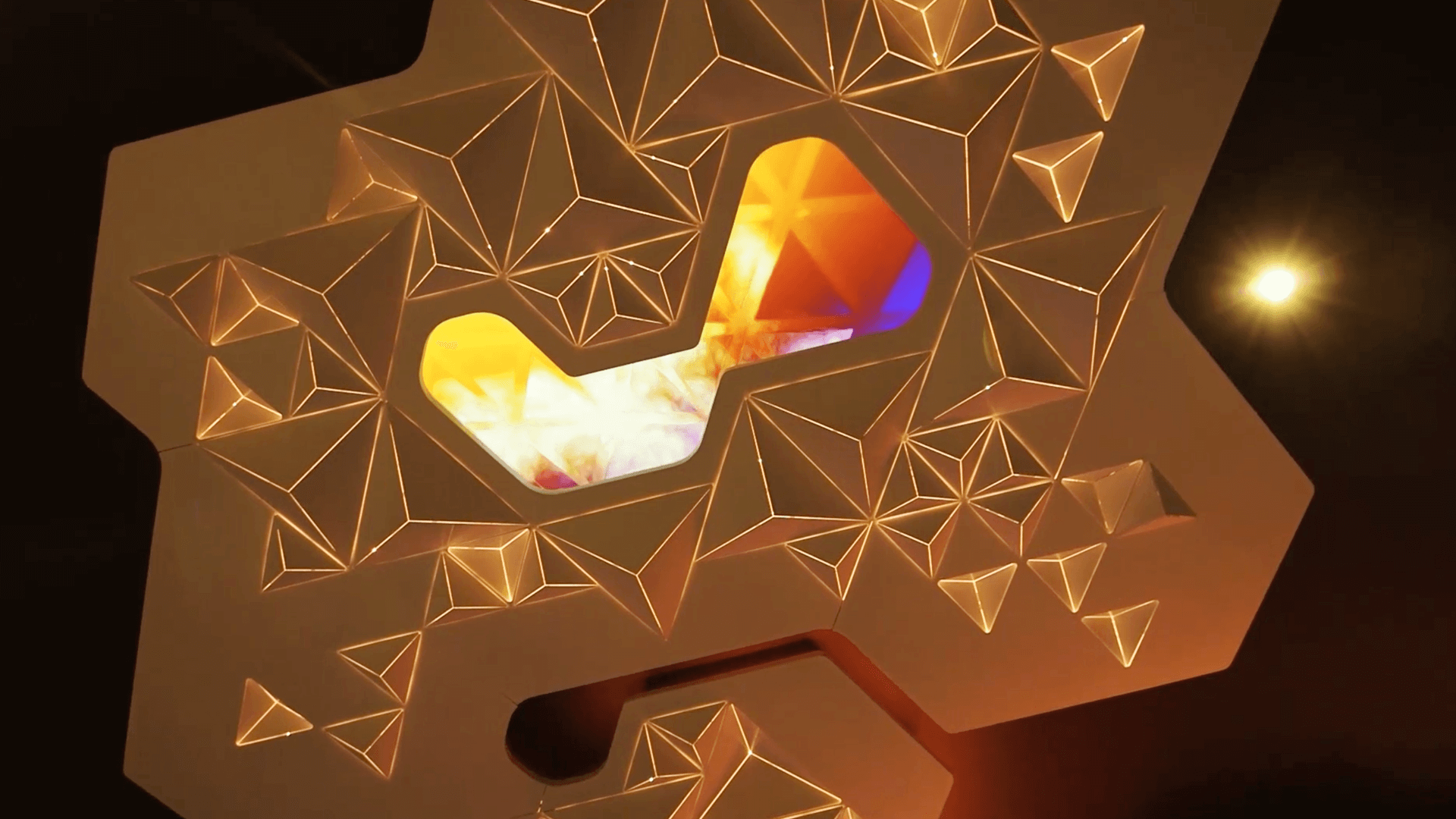
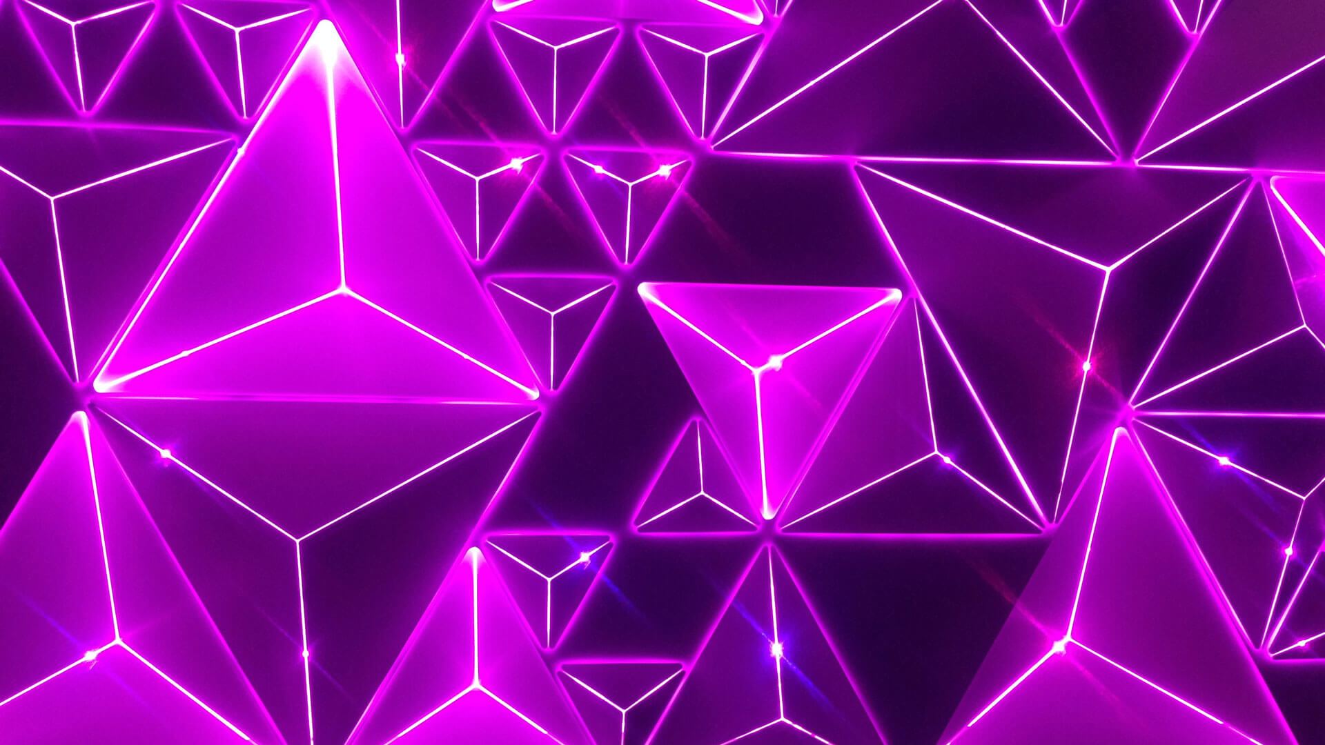
Cloud 9 is a futuristic bar and lounge that serves Texas-themed food and cocktails from Wolfgang Puck. The centerpiece of the lounge is the "Big Sky," a digital installation on the ceiling that combines abstract steel clouds, dynamic LED lighting, and 17 HD screens that create a large-scale abstract weather simulation. This experience offers guests a constantly changing surreal view of Dallas weather, rendered in real-time. The simulation cycles through different times of day and weather patterns, triggering color changes throughout the entire ceiling. Each moment is unique and seamlessly integrated with the architecture and design of the space.
My Role
I created 3D renderings and concept art to set the direction for the "Big Sky" installation. I also collaborated with the team to fine-tune the final look and feel on-site, in real-time.
Proof of Concept
The concept for the installation was for guests to be able to look up through a faceted glass ceiling while sitting at their table. Initially, the plan was to use real-time weather data to determine what was displayed above, but since the weather in Dallas doesn't change frequently enough, we decided to use a timer to achieve a more dramatic effect. Below are a few of the 3D and motion tests that I created to explore the potential of the "Big Sky" installation.
