MICROSOFT
TouchTones
Collaborative music sequencer
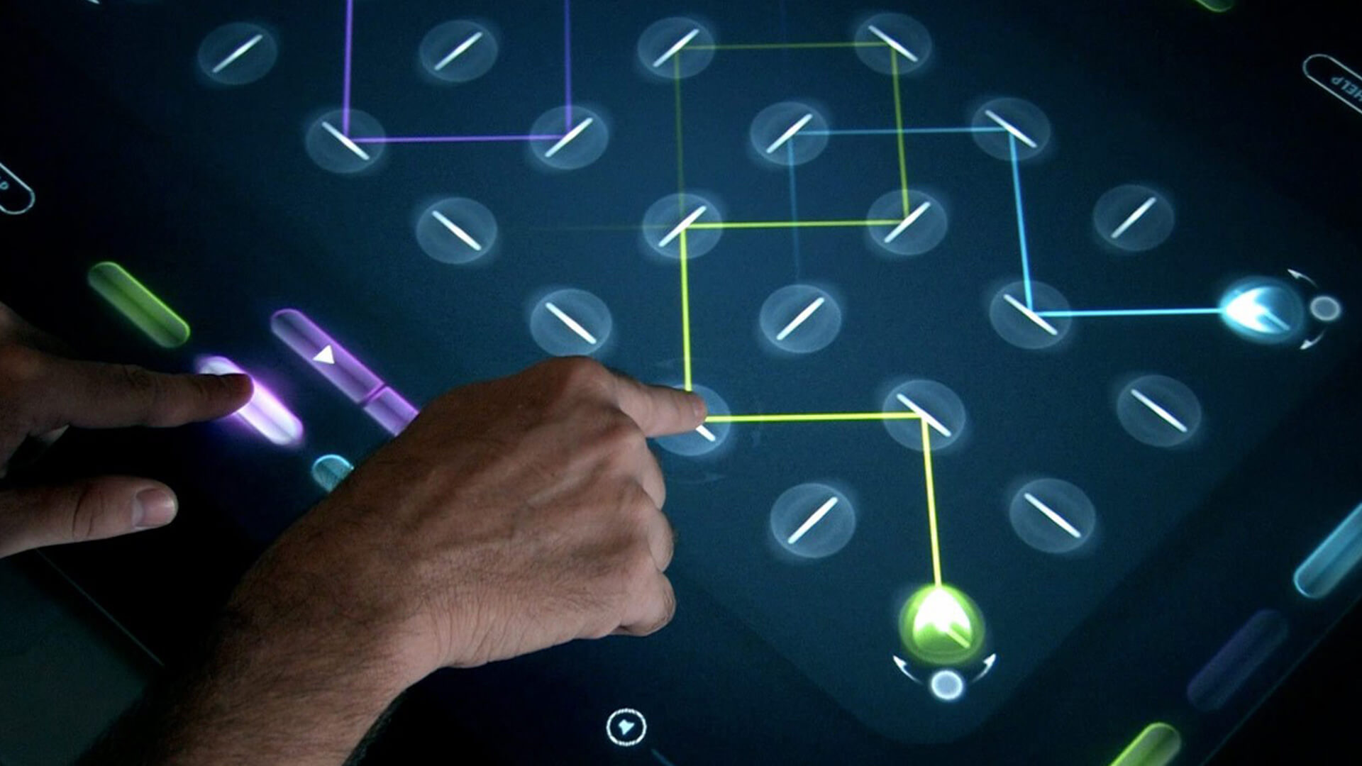
Our passion for music and interaction led to the development of TouchTones, a multi-user collaborative music sequencer that was designed to be accessible to anyone, regardless of musical knowledge. The instrument leveraged Surface's unique camera-based system to track finger orientation and touch position, allowing users to create beautiful music together in a unique and intuitive way.
My Role
As lead visual and UI designer, I played a key role in the development of the concept for TouchTones. I was responsible for all visual and UI design aspects of the project, working closely with the development team to ensure that the final outcome was cohesive and visually impactful. My contributions helped make TouchTones an accessible, intuitive, and fun instrument that allowed users to create beautiful music together, regardless of their musical knowledge.
TouchTones for Microsoft PixelSense
Version 2
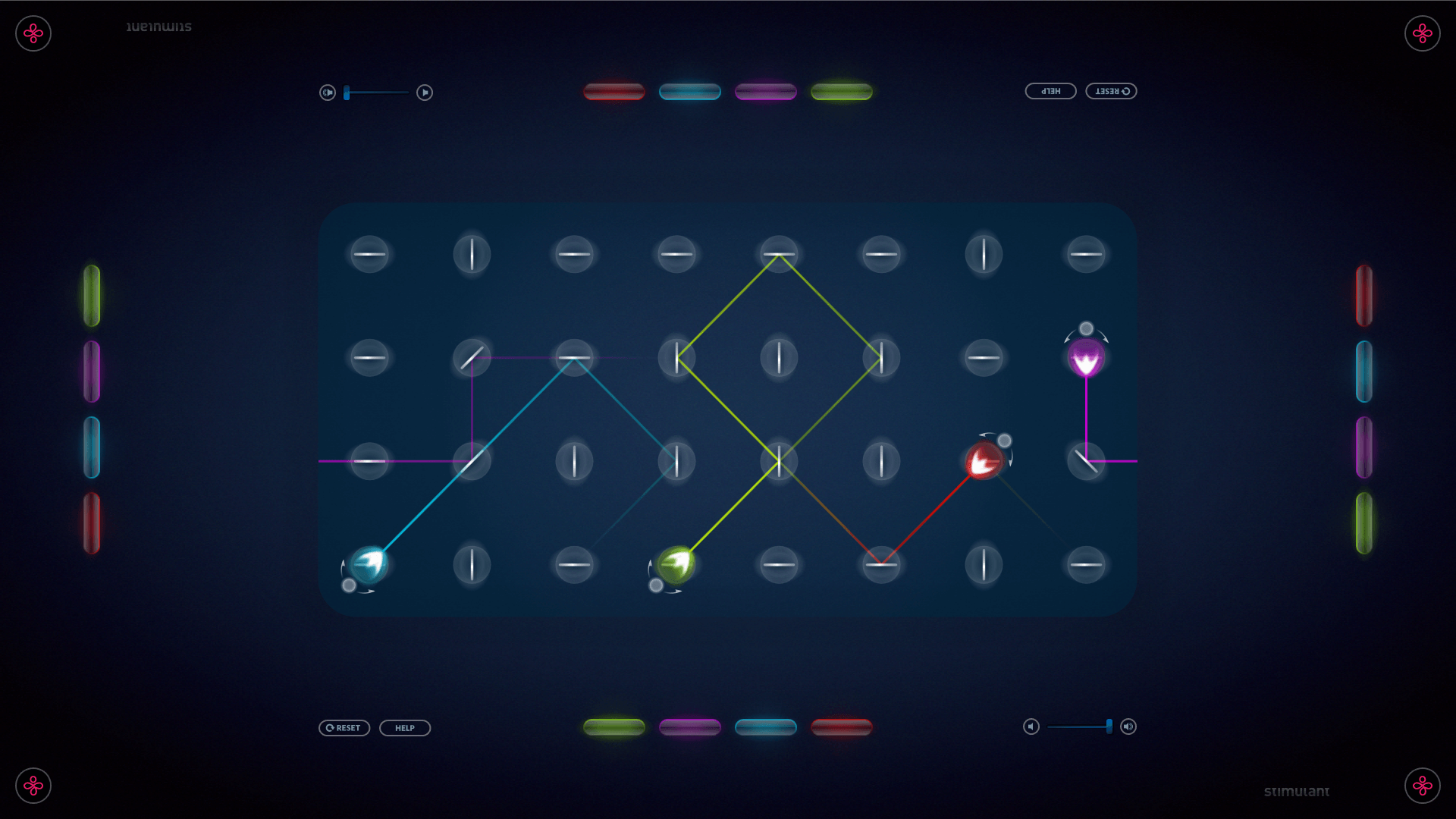
TouchTones for Microsoft PixelSense is a music-making application that allows multiple users to play music together on four different instruments. The instrument sounds are distributed across four octaves and are controlled by a master tempo. The interface uses a set of rotatable "mirrors" that reflect sound and play a note each time they are hit. The color of the mirrors represents different instruments. It's a unique and interactive way to create music.
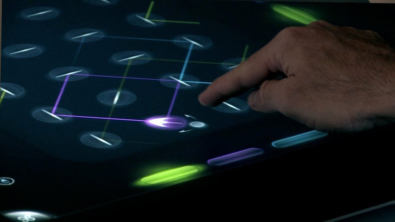
Design Concepts
My initial design concepts were centered around the use of animated sprites that exude a magical atmosphere. These designs were first created for the Surface table and subsequently modified to suit the higher resolution of the PixelSense version.
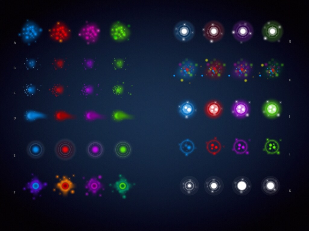
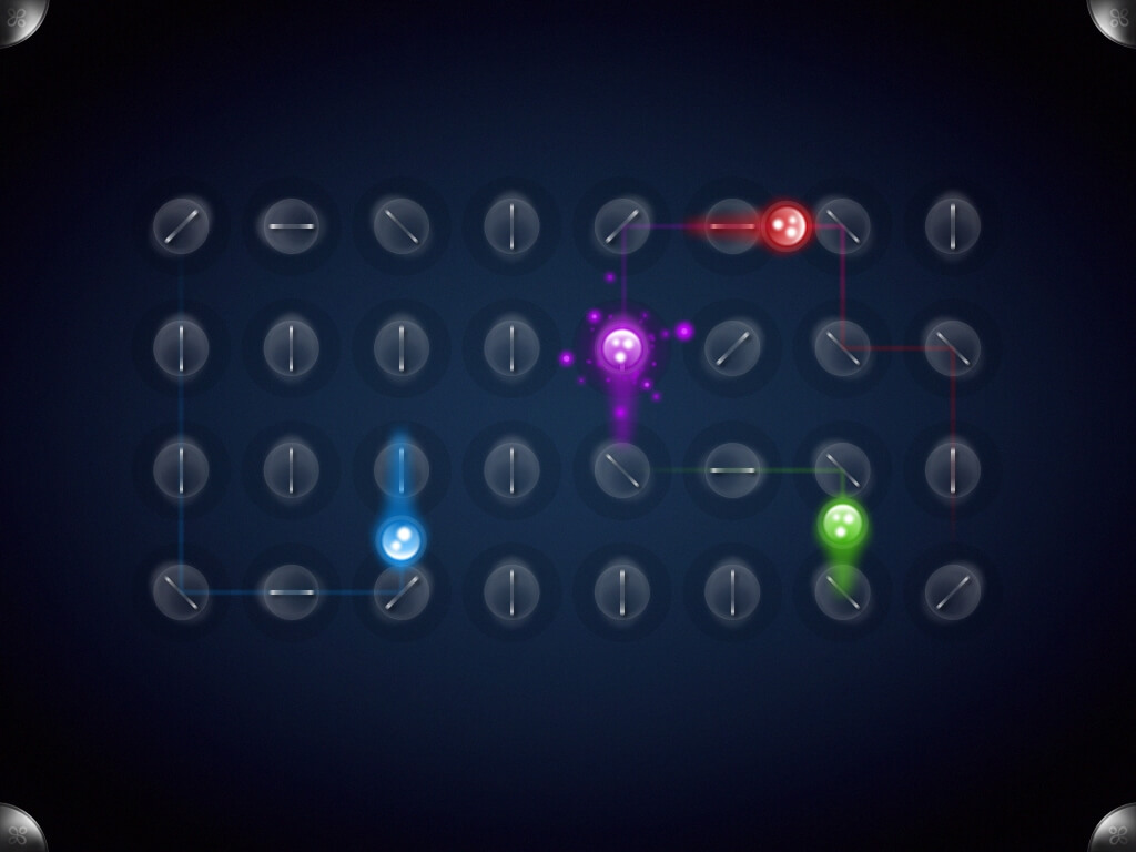
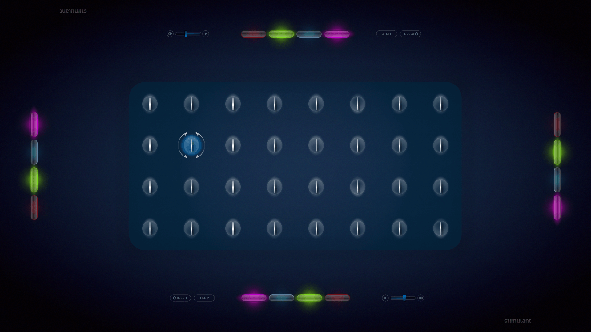
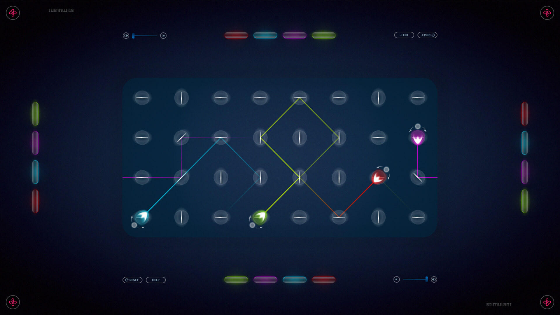
Touchtones for Microsoft Surface
Version 1
TouchTones for Surface v1 was the first app developed for the original Surface table. It was a proof of concept and was well-received, leading to a redesign for the updated PixelSense table.
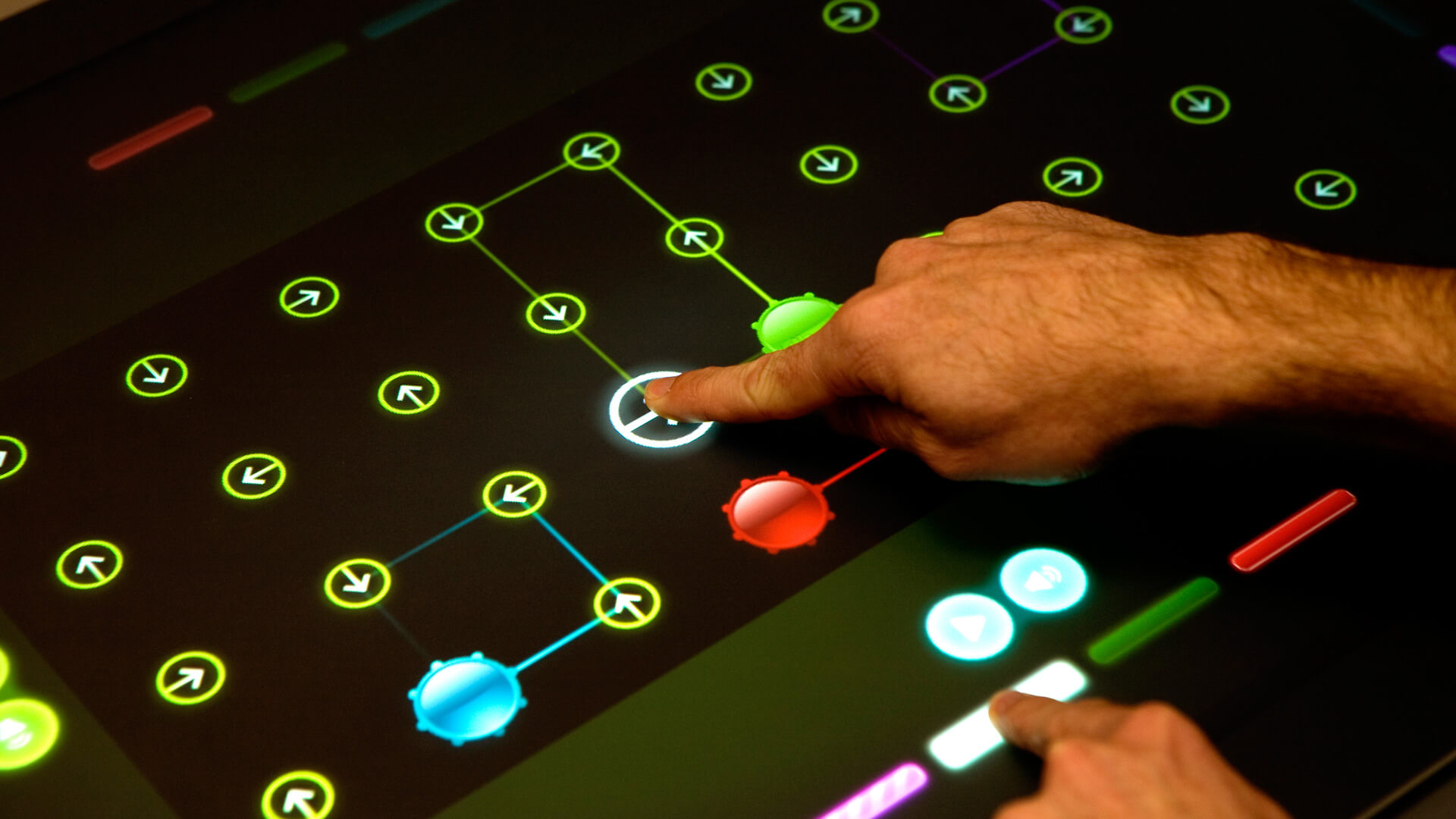
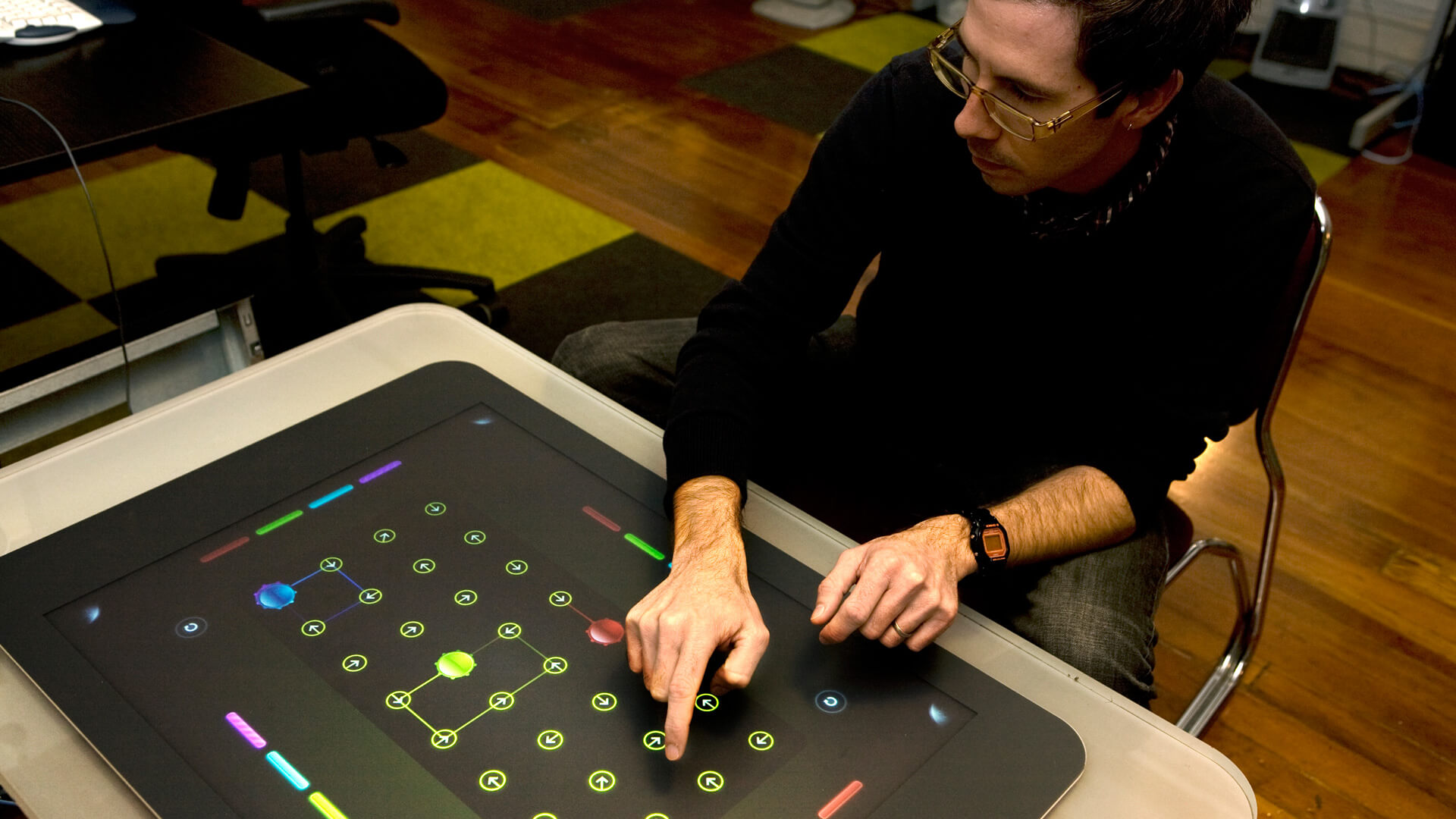
Touchtones for Windows Phone 7
Mobile App
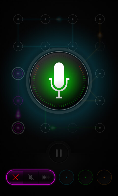
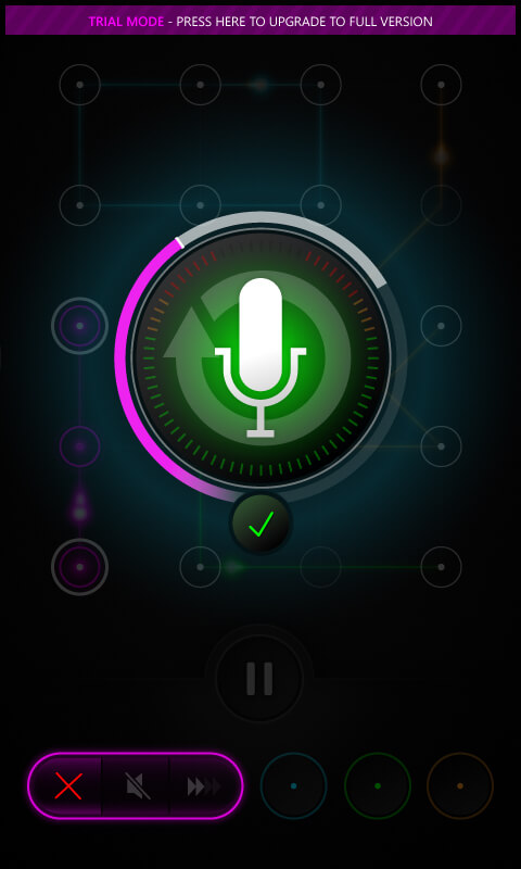
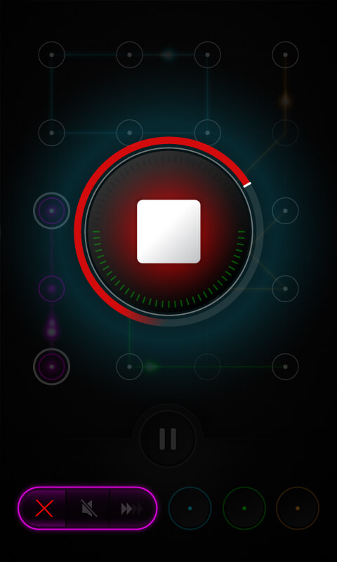
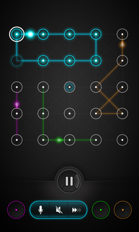
The success of the TouchTones table application inspired the development of a similar mobile app, with a reworked UI for the mobile context while maintaining the core concepts of ease of use, simplicity, and unexpected beautiful outcomes from user input. This was to make the app fun to use, similar to the original table application.
My Role
I was responsible for all of the visual and UI design. My main responsibilities were to handle all aspects of the visual and user interface design for the mobile app, making sure that it is user-friendly, intuitive, and visually appealing.
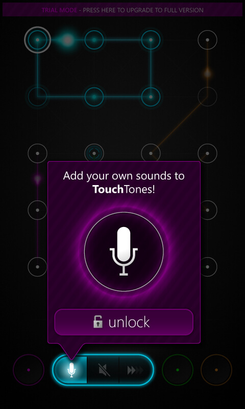
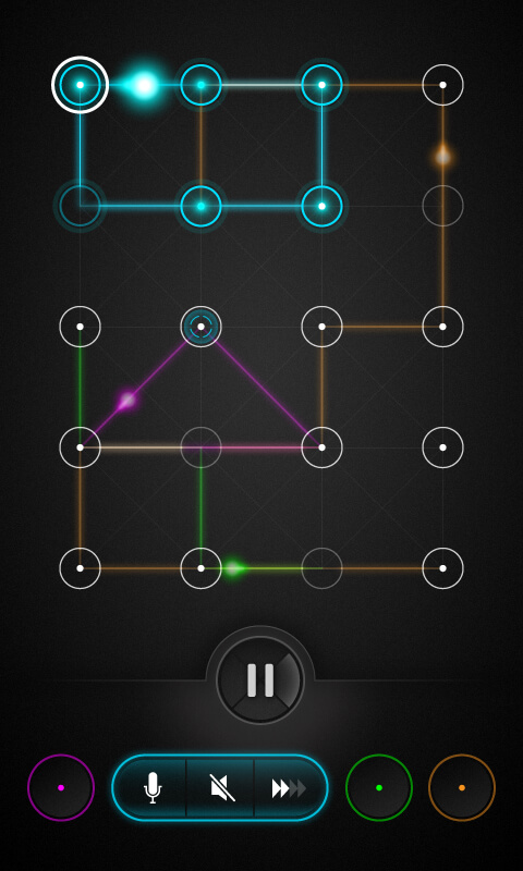
Design System
The design system I created for the TouchTones mobile app was not just an extension of the table app's design system. Instead, it was specifically tailored for usability on a smaller screen with smaller touch targets and included a more complex interface to take full advantage of the mobile platform.
